
When starting to explore design, we often focus on colors, typography, or layout… but there is a simple yet extremely important element that is often overlooked: whitespace. At first, it may seem like empty space with little purpose. In reality, whitespace is the factor that determines balance, readability, and the overall aesthetics of a layout. It allows content to “breathe,” creates natural emphasis on important elements, and delivers a smooth and comfortable user experience.
Whitespace is not just meaningless empty space; it is the invisible “glue” that connects elements, guides the viewer’s eye, and highlights information in a subtle way. In every design project – from websites and applications to graphic design – whitespace is the tool that makes layouts more professional and easier to absorb.

1. What is Whitespace?
Whitespace is the empty space between elements in a design, including text, images, buttons, or any interface components. It not only allows the layout to “breathe,” but also has a strong visual impact, helping users focus and absorb information more easily.
Types of Whitespace
- Active Whitespace:
Whitespace used intentionally to highlight content or emphasize important elements. For example, a “Buy Now” button placed separately will attract more attention and encourage interaction. - Passive Whitespace:
Whitespace that appears naturally without a clear intention, helping prevent the layout from feeling cluttered and maintaining a sense of openness. It is commonly seen between paragraphs, images, and columns in a layout.
Role of Whitespace
Whitespace makes a layout more readable, understandable, and visually appealing. It is like the “breathing rhythm” of a design: without it, the layout becomes overwhelming.
2. The Role of Whitespace in Design
Enhancing readability and comprehension
When a layout contains too much text or imagery, users can easily feel overwhelmed, leading to fatigue and difficulty focusing. Whitespace helps separate paragraphs, headings, lists, and other important elements, creating “breathing space” for the eyes. As a result, users can view and absorb information naturally, scan content more easily, and clearly understand each part of the layout.
Creating emphasis for important elements
Whitespace surrounding key elements – such as call-to-action buttons, primary images, or important messages – helps them stand out naturally. When a button or image is placed within open space, users’ attention is immediately drawn to it, increasing interaction rates and improving message delivery.
Improving user experience
A layout with well-balanced whitespace makes users feel more comfortable and at ease. Empty space helps separate content sections, reduces the feeling of clutter, and makes navigation and information retrieval smoother. This is especially important for web and mobile interfaces, where users need to process information quickly and intuitively.
Enhancing aesthetics and professionalism
Whitespace is not only functional but also elevates the overall visual appeal of a design. Well-known platforms like Apple, Google, and Medium use whitespace effectively to create a clean, modern, and refined look. The harmonious arrangement of elements and space conveys a sense of professionalism and credibility for the product or brand.

3. Principles for Using Whitespace Effectively
Proportion & Balance Principle
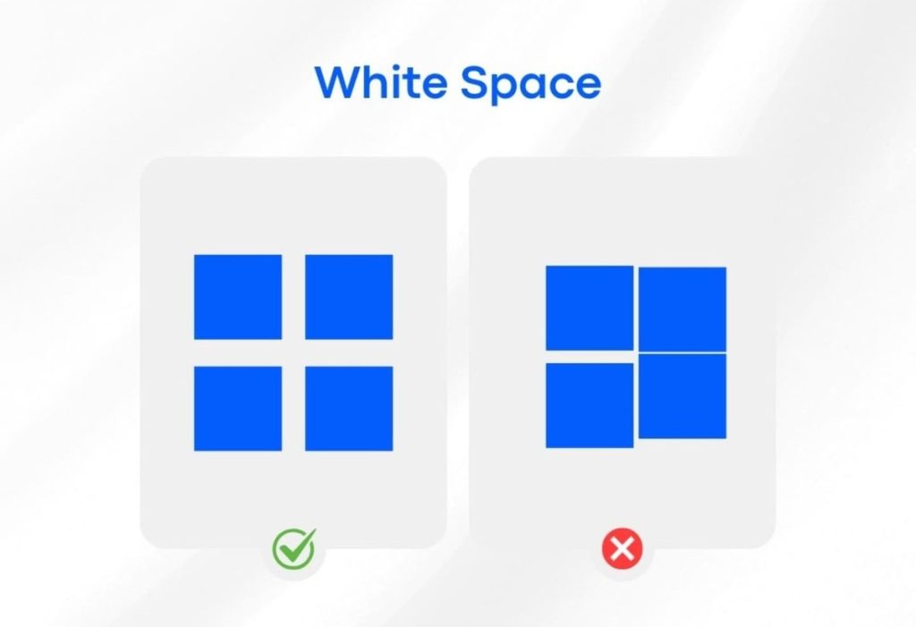
Whitespace should be balanced appropriately with content. If there is too little, the layout becomes cluttered and hard to read; if there is too much, the content may feel lost and disconnected. A common approach is to use grid systems or divide the layout into clear sections to maintain a proper ratio between content and whitespace, resulting in a harmonious and intuitive design.
Guiding Eye Principle
Whitespace can guide the user’s eye along the intended flow of information. For example, spacing between headings, images, and paragraphs creates a visual path from top to bottom, helping users absorb content in a natural and organized sequence without confusion.
Grouping & Separation Principle
Related elements should be grouped closely together, while unrelated elements should be separated by whitespace. This helps users recognize relationships between pieces of information and makes the layout clearer, more understandable, and more intuitive.
Consistency Principle
Maintaining consistent spacing between similar elements ensures a cohesive layout. For example, sections, buttons, or cards within the same design should have uniform spacing to avoid a messy or unprofessional appearance. Consistent whitespace also helps users navigate the interface more easily.
4. Common Mistakes When Using Whitespace
Overusing Whitespace
Many beginner designers assume that more whitespace is always better, but in reality, this can make a layout feel disconnected and lacking cohesion between elements. For example, when buttons, images, or paragraphs are placed too far apart, users may struggle to understand their relationships and identify the main message of the design.
Lack of Whitespace
On the other hand, insufficient whitespace results in a cluttered, overwhelming, and hard-to-read layout. Users can feel overloaded when their eyes have to process too much information at once. This not only reduces user experience but also causes important content to be overlooked, diminishing the effectiveness of communication.
Inconsistency
Using inconsistent spacing between similar elements, such as cards, buttons, or sections, disrupts visual consistency and creates a messy, unprofessional appearance. Users may find it difficult to understand the relationships between content and to navigate the interface effectively.
Ignoring Mobile Considerations
Whitespace designed for desktop may not translate well to smaller mobile screens. Without proper adjustments, layouts can become too dense or too scattered, negatively impacting the mobile user experience. Therefore, whitespace should be optimized across all screen sizes to ensure readability, usability, and visual harmony on both desktop and mobile devices.
5. Some Tips for Using Whitespace Effectively

Start with large blocks
First, identify the main sections of the layout, then refine the spacing within and between elements. This approach helps create a balanced and clear design, and makes it easier to adjust when adding new content.
Use a Grid System
Grids help position elements and whitespace in a consistent and structured way. With a grid, the layout becomes more balanced, easier for users to follow, and information is organized logically.
Test across multiple devices
Whitespace can appear differently on desktop, tablet, and mobile. It is important to test across various screen sizes to ensure the layout remains readable, harmonious, and comfortable on all devices.
Combine with color and typography
Whitespace does not work in isolation; when combined with color and typography, it creates a stronger visual impact. For example, whitespace around a bold heading makes it stand out, helping users focus on key information naturally.
6. Practical Examples
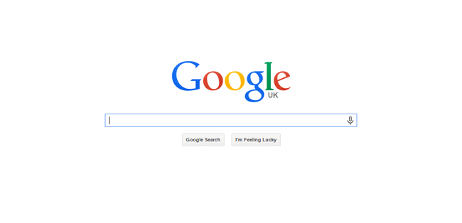
- Google: The interface is extremely clean and minimal, with ample whitespace around the search bar. This helps users focus immediately on the main objective without being distracted by other elements.
- Apple: Apple uses whitespace to highlight products and key information. Generous spacing between images and descriptions makes the design feel refined, modern, and easy to digest.
- Medium: On Medium, whitespace is applied between articles and within content sections, helping readers follow along easily, scan information quickly, and enjoy a more comfortable reading experience.
7. Conclusion
Whitespace may seem like “invisible” empty space, but in reality, it is a crucial element that makes a design more readable, balanced, and refined. When used effectively, whitespace not only highlights important elements but also improves user experience, enhances aesthetics, and adds professionalism to a layout.
Looking at examples such as Google, Apple, and Medium, it becomes clear that intentionally refining whitespace helps products become more intuitive and easier to engage with. By applying the principles and best practices of whitespace, anyone designing websites, applications, or digital products can leverage it to improve the overall user experience.
Whitespace is not “wasted space” but an invisible tool that creates distinction in design. Understanding and applying it correctly allows every layout to become more harmonious, visually appealing, and effective.
8. References
[1] R. Samara, Design Principles for User Experience. New York: Apress, 2018.
[2] K. Lidwell, J. Holden, and J. Butler, Universal Principles of Design, 2nd ed. Beverly, MA: Rockport Publishers, 2010.
[3] J. Krug, Don’t Make Me Think, Revisited: A Common Sense Approach to Web Usability, 3rd ed. Berkeley, CA: New Riders, 2014.
[4] A. Lupton, Thinking with Type: A Critical Guide for Designers, Writers, Editors, & Students, 2nd ed. New York: Princeton Architectural Press, 2014.
[5] Apple Inc., “Human Interface Guidelines: Visual Design,” [Online]. Available: https://developer.apple.com/design/human-interface-guidelines/visual-design/overview/. [Accessed: Oct. 19, 2025].
[6] Google, “Material Design Guidelines,” [Online]. Available: https://material.io/design/layout/spacing.html. [Accessed: Oct. 19, 2025].
[7] Medium, “Medium Design Guidelines,” [Online]. Available: https://medium.design/. [Accessed: Oct. 19, 2025].