When we look at a design – whether a website interface or a poster – the first impression often comes before we even realize why. Some designs make our eyes move smoothly, feeling comfortable and natural; others make everything feel heavy, uneven, and unpleasant. The difference usually lies in a fundamental yet subtle principle: Balance, or visual balance.
Balance is not just about arranging elements so that both sides are “equal,” but the art of distributing visual weight to create a sense of stability, harmony, and to guide viewers through the experience naturally. A balanced design helps viewers feel confident, absorb information more easily, and stay longer – something every designer aims to achieve.
1. Concept of Balance in Design
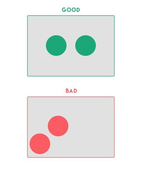
Balance in design is a state where visual elements – such as shapes, colors, forms, or white space – are arranged so that the overall composition feels stable and harmonious. This is not physical balance but perceptual balance, based on how the human eye evaluates the “visual weight” of each element.
An element can feel “heavy” or “light” depending on its size, color, or level of detail. For example, a large shape, a bold color, or a highly detailed element will attract more attention – meaning it feels “heavier” – compared to a small shape or a light color.
In design, the goal is not always perfect symmetry but creating a sense of overall balance, even if the elements differ. For instance, a large square on the left can be balanced by two smaller shapes on the right, as long as the composition feels harmonious and the viewer’s eye does not perceive it as off-balance.
2. Types of Balance in Design
In visual design, “balance” is not just about distributing elements for physical equilibrium, but also about creating a sense of stability and harmony when viewers look at the layout. There are three basic types of balance that designers commonly apply, depending on the communication goals and the overall style of the project.

2.1. Symmetrical Balance
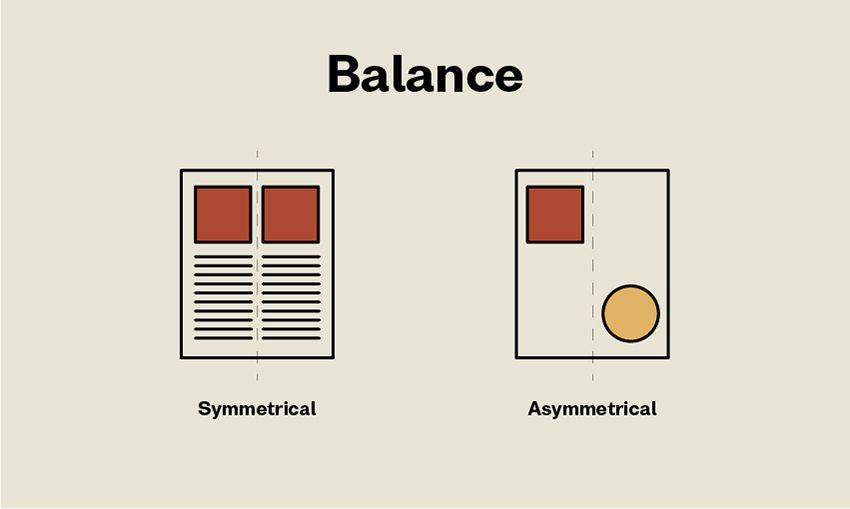
Definition: Symmetrical balance occurs when two halves of a layout mirror each other along an axis (usually vertical or horizontal). All elements – such as shapes, colors, or space – are distributed equally on both sides.
Characteristics: This type of balance provides a sense of stability, order, and formality. It helps viewers feel confident and reassured – hence it is often used in bank designs, corporate profiles, or large business websites.
Advantages: Easy to organize, read, and understand. Conveys professionalism and reliability.
Disadvantages: Can become boring or overly formal if overused. Lacks flexibility and surprise in the visual experience.
Design Tip: To avoid monotony, add a small creative detail, such as a subtle color change, typographic highlight, or delicate texture – maintaining overall symmetry while allowing the layout to “breathe” and feel lively.
2.2. Asymmetrical Balance
Definition: Asymmetrical balance does not rely on mirroring but on a sense of “equilibrium” in visual weight. Elements differing in size, shape, or color can still create a harmonious composition if arranged skillfully.
Characteristics: This type of balance feels more modern, creative, and natural. It is commonly seen in modern web design, portfolios, or landing pages that aim to express personality and flexibility.
Advantages: Brings dynamism, uniqueness, and draws attention. Makes it easier to create focal points and a sense of movement in the layout.
Disadvantages: Harder to control than symmetry because it relies heavily on visual judgment and experience. Incorrect distribution can make the layout feel off-balance or cluttered.
Design Tip: When using asymmetry, carefully consider the position, size, and white space. For example, a large image on the left can be balanced by a smaller but denser content block on the right. Always check the layout on multiple screen sizes to ensure a stable user experience.
2.3. Radial Balance
Definition: Radial balance occurs when elements are arranged around a central point – creating a sense of motion either toward or outward from the center.
Characteristics: This type of balance strongly attracts the eye and directs viewers toward the focal point. It is often seen in logos, circular charts, or radial infographics. It helps create focus and a sense of radiating energy.
Advantages: Creates a clear focal point and strong visual impact. Suitable for designs that need to draw attention to a single central element.
Disadvantages: Can be overused, making the layout “center-heavy” and less flexible for designs with multiple secondary elements.
Design Tip: Use radial balance when emphasizing a single key message. Ensure surrounding elements are evenly spaced and sized to avoid a swirling effect or imbalance.
3. Factors Affecting Balance
Several elements influence how balance is perceived in a design. Understanding these factors helps designers create stable and harmonious layouts:
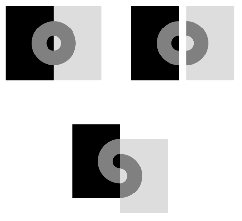
- Size: The larger an element, the “heavier” it feels visually. A large square draws more attention than a small one, even if both have the same color. In design, combining large and small elements helps create rhythm and natural focal points
- Color: Bold, highly saturated colors (such as red, orange, or black) generally feel heavier and more prominent than light or pastel tones. Placing a light color next to a dark one makes the dark area carry more visual weight.
- Position: The same object can feel different depending on its placement. Elements near the edges or corners of a frame often feel “heavier” than those at the center. Additionally, in left-to-right reading cultures, the top-left corner is typically considered the strongest point in a layout.
- Contrast: Strong differences between an element and its background (in color, brightness, or shape) make the element feel “heavier.” The more it stands out, the greater its perceived visual weight.
Texture/Detail: Areas with patterns, lines, or intricate details appear “heavier” than flat, smooth regions. Texture adds depth and holds the viewer’s attention longer. - Shape: Shape also affects visual weight. Triangles or squares often feel stable and heavier than circles. The orientation of shapes changes perception too – for example, an upward-pointing triangle feels solid, while a downward-pointing one can create unease.
- Negative Space: White space is not just “empty” but a crucial tool for balance. Ample negative space creates a light, airy feel, while a lack of it makes the layout feel “heavy” and cramped.
When designing, I always consider these factors together. A small element with bold color and high contrast can completely “balance” a large, pale block. It is precisely the flexible combination of these elements that creates a sense of harmony and professionalism throughout the entire layout.
4. Applying Balance in Web Design
Balance in web design is not just an aesthetic factor – it also directly affects how users perceive and interact with a website. A well-balanced layout helps viewers absorb information easily, feel more confident, and naturally directs their attention to the most important sections.
Guiding the Eye (Visual Flow): When elements on a page are arranged harmoniously, the user’s eye moves smoothly from the headline → content → call-to-action (CTA) button. Conversely, if the layout is unbalanced, the gaze can be interrupted or focused in the wrong place, reducing the effectiveness of information delivery.
Increasing Trust: A well-balanced website conveys professionalism, clarity, and stability – especially important for e-commerce or business sites. Users tend to trust an interface that “feels organized,” as it reflects the brand’s care and credibility.
Optimizing Actions (Conversion): When elements around the CTA are balanced, users focus more on the action you want them to take – such as “Sign Up,” “Buy Now,” or “Contact Us.” A CTA that is too isolated or surrounded by heavy content loses its effectiveness.
Practical Principles:
- Use a Grid System: Grid systems, such as a 12-column grid, help maintain order and alignment while still allowing flexibility for creating asymmetrical layouts.
- Utilize White Space: Empty space is not “wasted” but an essential tool for creating balance. A little space around elements makes the layout feel breathable and clearer.
- Test on Multiple Screen Sizes: A layout that is balanced on a desktop may not remain so on mobile. On smaller screens, elements can become misaligned or too crowded, so it’s important to adjust focal points to maintain a sense of equilibrium.
Practical Example (Design Thinking): Imagine a brand’s homepage with a large hero image on the left and a signup form with a CTA button on the right. On desktop, this layout feels fairly balanced. However, on mobile, the hero image may take up almost the entire screen, pushing the form downward. To fix this, a designer could reduce the image size, add white space around the form, or place a small logo in the top corner to maintain overall balance.
A beautiful website is not just about colors or fonts – it’s about the sense of “stability” users feel when all elements are thoughtfully arranged. This is the power of Balance in the visual experience.
5. Common Mistakes When Applying Balance
When applying the principle of Balance, many designers (myself included in the past) can easily make mistakes that cause the layout to feel unnatural or lose its focal points.
Overemphasizing Symmetry: Trying to make everything perfectly “even on both sides” can make a design feel rigid and lack rhythm. Sometimes, a subtle asymmetry makes the layout feel more lively and modern.
Ignoring Visual Weight: Focusing only on size while neglecting color and detail is a common mistake. A small dark-colored area or a highly detailed section can feel “heavier” than a large, pale block.
“Fake Balance”: Arranging elements to appear even in number but losing true equilibrium. Visual balance doesn’t come from equal division but from a harmonious perception.
Not Testing Across Platforms: A layout balanced on desktop may become misaligned on mobile. Always test on multiple screen sizes to ensure a stable visual experience.
Neglecting White Space: Cramming too much content makes the page feel heavy and suffocating. White space acts as “breathing room,” keeping the design light and readable.
Understanding and avoiding these mistakes helps ensure that a design is not only visually appealing but also naturally balanced and professional.
6. Conclusion
The principle of Balance plays a key role in creating a stable and pleasant visual experience for users. A well-balanced layout makes content clear, easy to absorb, and conveys the professionalism of the entire website. Whether you choose a symmetrical style to provide a sense of order or an asymmetrical approach to create dynamism and modernity, the important thing is to maintain overall harmony. When elements are arranged intentionally, users not only feel comfortable viewing the design but also can easily focus on the message you want to convey.
7. References
[1] S. Krug, Don’t Make Me Think: A Common Sense Approach to Web Usability, 3rd ed. Berkeley, CA: New Riders, 2014.
[2] J. Nielsen, Designing Web Usability: The Practice of Simplicity. Indianapolis, IN: New Riders, 1999.
[3] R. Lidwell, K. Holden, and J. Butler, Universal Principles of Design, 2nd ed. Beverly, MA: Rockport Publishers, 2010.
[4] A. Lupton, Graphic Design and Visual Culture: Theories and Principles. New York, NY: Princeton Architectural Press, 2017.
[5] Interaction Design Foundation, “Visual Balance in UI Design,” Interaction Design Foundation, 2023. [Online]. Available: https://www.interaction-design.org/literature/topics/visual-balance. [Accessed: Oct. 19, 2025].