In design, Proximity is a fundamental principle that helps organize layouts and guide the viewer’s eye. Whether in user interface (UI) design, website design, or graphic design, Proximity plays a central role: it determines how users perceive the relationship between elements and intuitively understand the information structure.
When applied correctly, Proximity helps create connections between related elements while establishing clear separation between unrelated content. This balance makes the interface organized, readable, and professional. Conversely, ignoring Proximity can make a layout – no matter how attractive the colors or fonts – feel cluttered and confusing, causing users to lose their sense of direction.
1. Concept and Significance of Proximity
In design, Proximity is the principle of organizing elements based on spatial relationships. Elements that are related in content or function are placed close to each other so that viewers can easily recognize them as part of the same group. Conversely, unrelated elements should be separated by space, helping users clearly distinguish between different blocks of information.
Simply put, proximity acts like a language of layout in design – allowing users to read and understand the structure of information intuitively, rather than having to reason it out.
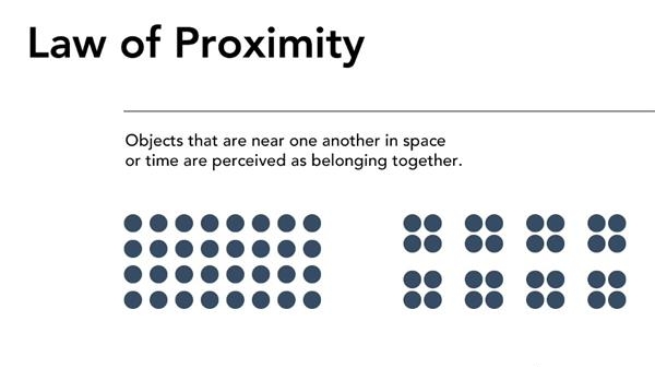
This principle stems from Gestalt theory of visual perception, where humans naturally tend to group nearby elements into a unified whole. Therefore, even slight adjustments in spacing can make a layout convey a message more clearly or, if mismanaged, appear cluttered and confusing.
It is also important to distinguish Proximity from Alignment. Alignment refers to arranging elements along a common axis or line to create order and stability. Proximity, on the other hand, focuses on spatial relationships – emphasizing the connection or separation between groups of content. These two principles are often combined to achieve a layout that is harmonious, coherent, and easy to navigate.
2. Why Proximity Is Important in Design
Proximity is a visual factor that helps shape the user experience and enhances clarity in design. When applied correctly, it not only improves the interface but also optimizes information delivery:
- Helps users quickly recognize content structure: Related elements, such as headings, descriptions, and action buttons, when placed close together, are naturally perceived by users as a unified group of information.
- Enhances visual hierarchy: The spacing between elements, combined with size, color, and font weight, guides viewers to distinguish primary content from secondary content.
- Improves readability and navigation: Clearly grouped information allows the eye to move smoothly across the layout, reducing confusion when following content.
- Creates a tidy and professional appearance: A layout with appropriate spacing makes the entire design feel refined, visually appealing, and trustworthy.
Example: In a registration form, if the labels are placed too far from the input fields, users may get confused about which label corresponds to which field – simply reducing the distance appropriately makes the experience clearer and more coherent.
3. Principles for Applying Proximity Effectively
To make the most of the Proximity principle in design, pay attention to the arrangement and spacing of elements so that the layout is both intuitive and easy to understand:
- Group related elements closely together: Components that share a content or functional relationship — such as headings and descriptions, icons and labels, or labels and input fields — should be placed near each other so users can easily recognize their connection.
- Create clear spacing between different groups: Unrelated content groups need sufficient white space to separate them, helping the viewer’s eye avoid confusion between sections.
- Combine with other design principles: Proximity works best when used alongside Alignment, Contrast, and White Space, creating a harmonious, balanced, and easy-to-follow layout.
A design with properly grouped elements helps users “read” the interface naturally and navigate it efficiently.

4. Common Mistakes When Applying Proximity
Although the Proximity principle may seem simple, many designers still make mistakes in practice. Here are common errors and ways to address them:
- Related elements are placed too far apart: A typical example is when a label is separated from its input field, making it unclear which description belongs to which field. This reduces intuitiveness and increases the likelihood of user errors.
- Inconsistent spacing: When different areas have varying spacing, the overall layout feels disjointed. Users may perceive the interface as “misaligned,” even if the content itself is correct.
- Grouping too many elements together: Another common mistake is trying to pack everything into one block, making the interface crowded, lacking emphasis, and hard to focus on.
- Using color as a substitute for spacing: Some designers assume that changing colors can separate groups, but color alone cannot replace white space. Proper spacing is crucial for clarity.
- Not testing across different screen sizes: Proximity must be flexible — spacing that works on desktop may be too wide or too narrow on mobile.
Solution:
Create a consistent spacing system (for example: 4px, 8px, 16px…), test it across multiple devices, and gather feedback from colleagues or real users. This is the most effective way to ensure your layout remains clear, intuitive, and user-friendly.
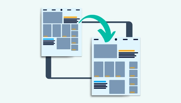
5. Application of Proximity in Modern Web and UI/UX Design
Proximity is a principle present in almost every element of web and user interface (UI/UX) design. When applied correctly, it helps organize information clearly, reduces cognitive load, and naturally guides the user’s visual flow.
- Navigation Bar: Related items should be grouped close together. For example, the “Account” group can include “Profile,” “Settings,” and “Logout.” At the same time, main navigation groups should have enough space from secondary groups (like search, cart, or notification icons) so users can easily distinguish them.
- Forms and Input Fields: Each group consisting of label – input – hint text should be placed close together so users understand their connection. Separate input groups should have enough spacing to clearly differentiate them.
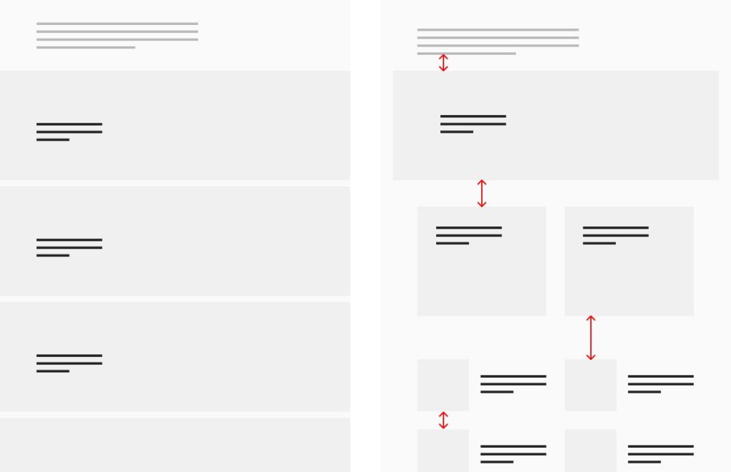
- Card Layouts: In interfaces using cards, elements such as the title, short description (excerpt), and CTA button should be close together to show they belong to the same content. Different cards need reasonable spacing to avoid a cramped or cluttered feeling.
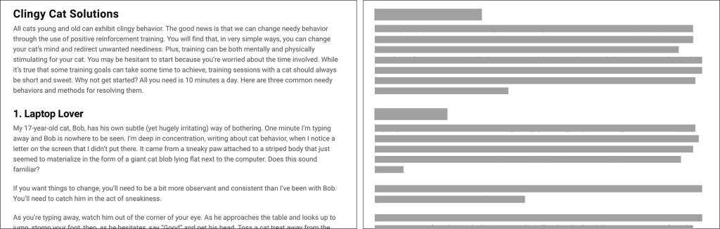
- Typography and Text Layout: The spacing between headings and paragraphs directly affects readability. If a heading is too far from its content, readers might not associate it with the section below. Adjust line-height, margin, and padding proportionally to maintain clarity.
- Design Tool Support: Tools like Figma, Adobe XD, and Sketch offer grids, auto-layout, and smart spacing features that help designers maintain consistent spacing throughout the project.
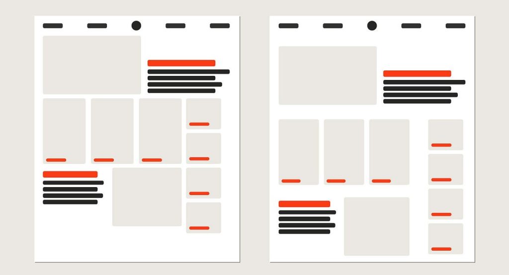
Illustrative Example:
Suppose you are designing two product cards.
- Design A: The title is close to the CTA (“Buy Now”), while the description is spaced appropriately – users immediately understand that the button belongs to this product.
- Design B: The title is placed far away, and the CTA is near another image, causing users to mistakenly think the action button belongs to the other image.
Even small differences in proximity can significantly affect clarity and user comprehension, demonstrating how critical this principle is in UI/UX design.
6. The Relationship Between Proximity and User Experience (UX)
Proximity is not just a visual matter — it directly impacts user experience (UX) through how users perceive and process information. When elements in an interface are arranged logically, the brain doesn’t have to “decode” the page structure, allowing users to focus on their main goals instead of figuring out how to use the interface.
Specifically, applying Proximity well helps to:
- Reduce cognitive load: When related elements are placed close together, users can easily recognize their relationship without much thought. For example, if a “Sign Up” button is positioned immediately below an input form, users instantly understand the next action without instructions.
- Increase task completion speed: A clear layout allows users to locate and interact with desired elements faster. Filling out forms, finding action buttons, or navigating between content sections becomes more intuitive.
- Enhance perception of professionalism: An interface with appropriate spacing feels tidy, refined, and trustworthy. Users tend to value products with clear designs because they reflect the brand’s attention to detail and systematic approach.
In other words, Proximity serves as a bridge between design and experience – it makes users feel comfortable intuitively, because everything is arranged as they expect.
7. Applying Proximity in Practice
To apply the principle of Proximity effectively in design, I usually follow several steps and practical habits. These are not just technical checklists but also ways to maintain clarity, balance, and professionalism across all design projects.
- Start with an observational pass: Before diving into details, look at the interface as a whole and ask yourself: “Which elements are related?” If your eye has to “jump” across too much empty space to understand the layout, the spacing is likely off. Adjust distances to reflect the natural relationships between elements.
- Use a grid system and spacing scale: A consistent spacing system (e.g., based on an 8px or 4px scale) ensures the entire design is coherent and scalable. This also helps teams work consistently when multiple designers are involved.
- Combine spacing with contrast: Don’t rely on distance alone to indicate importance. Both spacing and contrast should work together: spacing to separate, contrast to emphasize.
- Test across multiple screen sizes: Proximity can be perceived differently on desktop, tablet, or mobile. Make sure content groups remain clear across all viewports.
- Seek feedback from people outside the design team: Those unfamiliar with the interface often spot spacing or grouping issues that designers might overlook due to familiarity.
- When in doubt, increase spacing between groups: Generally, clearly separating groups is safer than placing elements too close together. A “breathing” layout makes it easier for users to navigate and feel comfortable.
8. Conclusion
Proximity is a fundamental principle in visual design, playing a key role in organizing information and shaping the user experience. In this article, we have explored its concept, importance, application methods, common mistakes, and best practices for effectively using Proximity in web and UI/UX design.
From practical examples, it is clear that the spacing between elements is not only an aesthetic choice but also a visual communication tool. A layout with proper Proximity helps users quickly understand the content structure, perform actions accurately, and perceive the product as professional. Conversely, inconsistent placement or confusing spacing can significantly reduce usability and trustworthiness.
In design practice, Proximity should be considered part of an overall design thinking system – combined with alignment, contrast, and white space to create a harmonious, logical, and user-friendly layout. When applied correctly, this principle allows designers to convey information naturally, consistently, and effectively across any platform or device.
In short, Proximity is not just about “placing elements near or far”; it is the art of arranging them so that users immediately grasp what you want to communicate the moment they see the design
9. References
[1] S. Krug, Don’t Make Me Think: A Common Sense Approach to Web Usability, 3rd ed. Berkeley, CA: New Riders, 2014.
[2] R. Williams, The Non-Designer’s Design Book: Design and Typographic Principles for the Visual Novice, 4th ed. San Francisco, CA: Peachpit Press, 2015.
[3] J. T. Hackos and J. C. Redish, User and Task Analysis for Interface Design. New York, NY: Wiley, 1998.
[4] N. Babich, “The principle of proximity in UX design,” UX Planet, Oct. 2018. [Online]. Available: https://uxplanet.org/the-principle-of-proximity-in-ux-design-81c5f41f3f75
[5] Interaction Design Foundation, “Proximity,” Interaction Design Foundation, 2022. [Online]. Available: https://www.interaction-design.org/literature/topics/proximity
[6] A. Marcotte, “Designing with proximity,” Smashing Magazine, Jan. 2019. [Online]. Available: https://www.smashingmagazine.com/2019/01/designing-with-proximity/