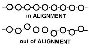
In visual design, Alignment is a principle that shapes the order and connections among elements within a layout. It helps the viewer’s eye move naturally, easily recognize the information structure, and perceive overall harmony. When elements are placed along the same axis or share a clear reference system, the design becomes unified and professional. Alignment is not merely a technical aspect; it also reflects organizational thinking and how a designer tells a story through visuals. Therefore, understanding and correctly applying Alignment is foundational for creating a consistent and effective visual experience.
1. Concept and Significance of Alignment in Design
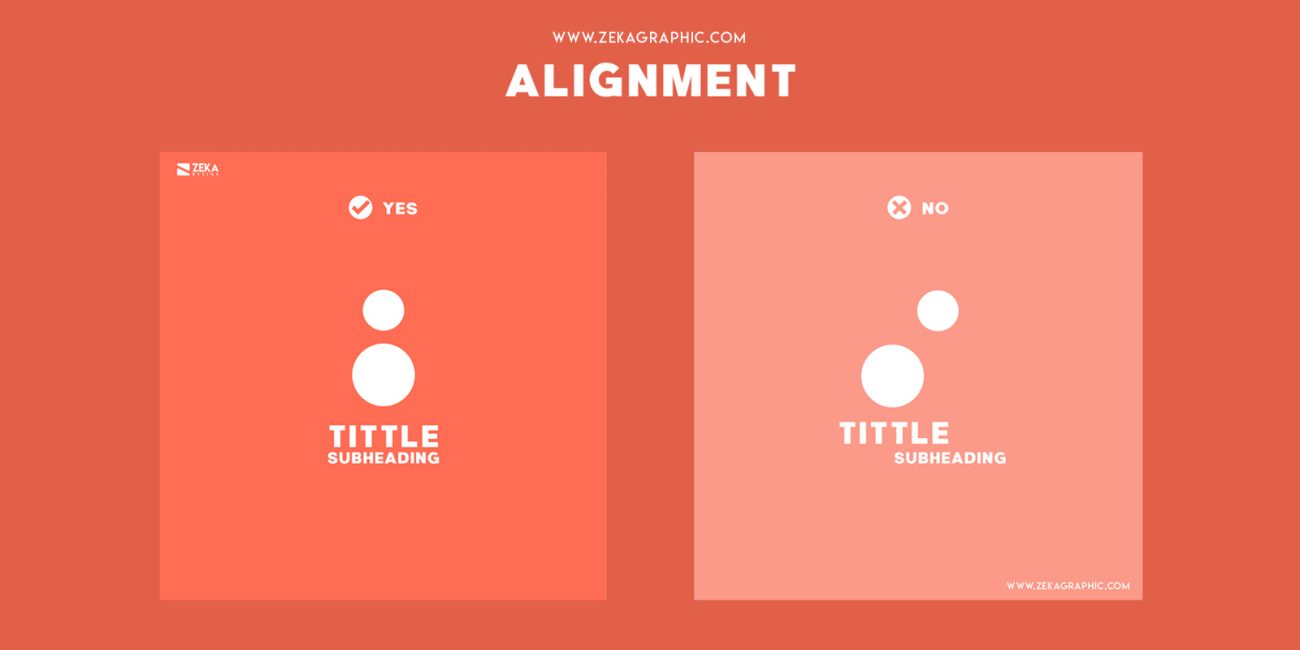
Alignment is not just about “text justification”; it is the principle of arranging all visual elements (such as text, images, buttons, icons…) so that they lie on the same axis or a logical grid system. When elements are properly aligned, viewers can easily follow the layout, understand the relationships between components, and perceive the professionalism and cleanliness of the design.
Significance of Alignment:
- Organization: Helps structure content clearly, making it easier for users to scan information.
- Connection: Elements on the same axis give the impression of belonging to the same idea group.
- Stability: Alignment lines act as the “spine” of the layout, providing a sense of solidity and balance.
Distinction from related principles:
- Proximity: Focuses on the distance between elements to show relationships, rather than defining alignment axes. Balance: Aims at distributing visual weight; alignment is often the tool used to achieve this.
Example:
A landing page lacking alignment often results in misaligned headings, descriptions and CTA buttons not on the same line, and scattered icons – creating a cluttered and unprofessional appearance. Conversely, when elements are precisely aligned, the entire layout becomes cohesive, visually clear, and guides users more effectively.
2. Basic Types of Alignment in Design
In design, there are four common types of alignment, each with its own characteristics and suitable for different contexts. Choosing the right type of alignment helps guide the viewer’s eye and maintain consistency throughout the layout.
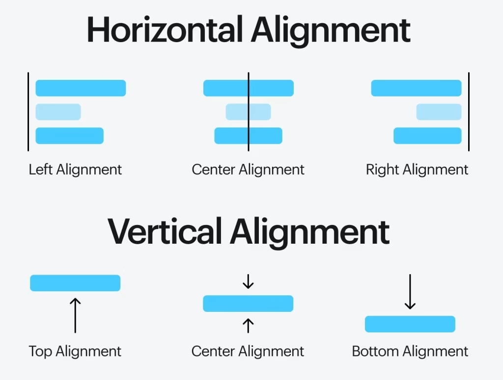
2.1 Left Alignment
- Advantages: Creates a natural reading flow, easy to follow – especially effective for left-to-right languages
- Disadvantages: May make the layout appear unbalanced if applied to symmetrical design elements.
- Use for: long content, descriptions, articles, or lists.
2.2 Right Alignment
- Advantages: Helps group information into clear columns, particularly useful for numbers, forms, or right-to-left languages.
- Disadvantages: Reduces readability for long text in LTR languages.
- Use for: reports, table data, labels in forms.
2.3 Center Alignment
- Advantages: Provides a balanced and formal feel, suitable for short elements like headings, hero sections, or quotes.
- Disadvantages: For long paragraphs, it can make it difficult for the eye to find the starting point, disrupting reading flow.
- Use for: main headings, posters, callouts, or short introductions.
2.4 Justified Alignment
- Advantages: Creates a neat, block-like text appearance, often used in print for a professional look.
- Disadvantages: Can create large gaps (“rivers”) if not properly adjusted.
- Use for: magazines, books, printed materials, or PDF layouts.
Note: There is no “best” alignment – each type serves a different visual purpose. The key is to choose the alignment that fits the content and user experience you aim to create.
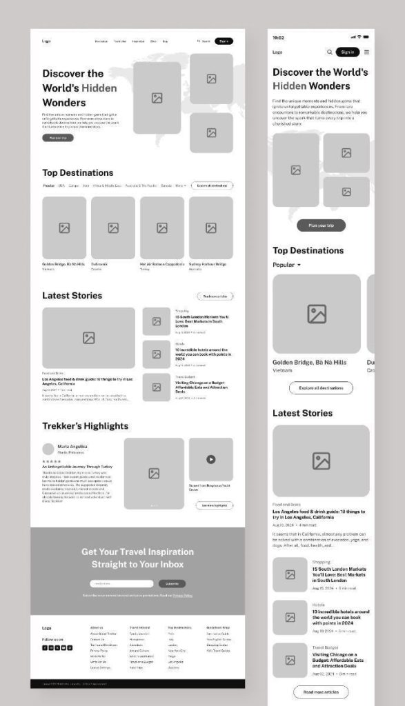
3. Alignment in Web and UI/UX Design
In web and UI/UX design, alignment plays a crucial role in guiding the user’s eye, enhancing information retention, and helping users perform actions more efficiently – for example, easily identifying call-to-action (CTA) buttons or related content groups. A well-aligned layout conveys professionalism, consistency, and usability.
3.1 Grid Systems and Alignment Techniques
Grid System: The foundation of all web alignment. It provides a mathematical structure of columns, rows, gutters, and margins, ensuring elements are placed accurately and harmoniously.
- Flexbox: Ideal for one-dimensional alignment (horizontal or vertical), especially useful for centering or evenly distributing elements within a row.
- CSS Grid: More powerful for two-dimensional layouts, allowing precise placement of elements by row and column – perfect for complex layouts or dashboards. A proper combination of these techniques ensures web layouts are both flexible and consistent in alignment.
3.2 Alignment for Components
- Buttons: Should align with descriptions, headings, or forms to create a seamless action flow.
- Label & Input: Labels should be aligned either left (left-aligned) or top (top-aligned) to help users clearly associate labels with input fields.
- Icon & Text: Maintain consistent spacing and alignment axes to avoid a “misaligned” or unbalanced look.
Alignment in UI/UX is not just a visual concern – it directly affects how users understand, interact with, and perceive your digital product.
4. Relationship Between Alignment and Other Design Principles
Alignment rarely works in isolation — it usually combines with other principles to create a clear, harmonious, and purposeful visual layout. This collaboration helps viewers not only “see” but also “understand” the information structure that the designer intends to convey.
4.1 Alignment + Proximity
When elements are aligned along the same axis and placed close together, users can easily recognize their relationship. For example, in a product card, positioning the image, name, price, and purchase button along a vertical axis helps viewers immediately understand that this is a unified information group. Without proper alignment, elements may appear separate even if they are physically close, reducing visual clarity.
4.2 Alignment + Hierarchy
Alignment supports visual hierarchy in design. When headlines, subheadings, and body text are aligned along the same axis, the reader’s eye naturally follows the intended order: from the most important information to supporting details. This consistency creates a smooth reading experience while emphasizing the information hierarchy across the entire layout.
4.3 Alignment + Balance
Alignment is also a key tool for achieving visual balance. Left alignment provides a sense of stability and natural flow, center alignment creates symmetry, while right alignment is often used to emphasize or create a special focal point. Combining proper alignment with balance ensures that the layout does not feel “heavy” on one side while maintaining a harmonious visual rhythm.
For example, on a product landing page, the logo and navigation bar are often placed along the same horizontal axis to create stability. Product images are centered along the vertical axis, while the CTA (Call to Action) sits directly below the description. This purposeful alignment guides the user’s eye naturally – from top to bottom, left to right – without requiring extra effort to navigate.
5. Common Mistakes When Applying Alignment
Although alignment is a fundamental principle, in practice – especially in web and UI/UX design – many people make errors that undermine consistency and professionalism. Understanding these mistakes helps avoid “small but critical” errors during the design process.
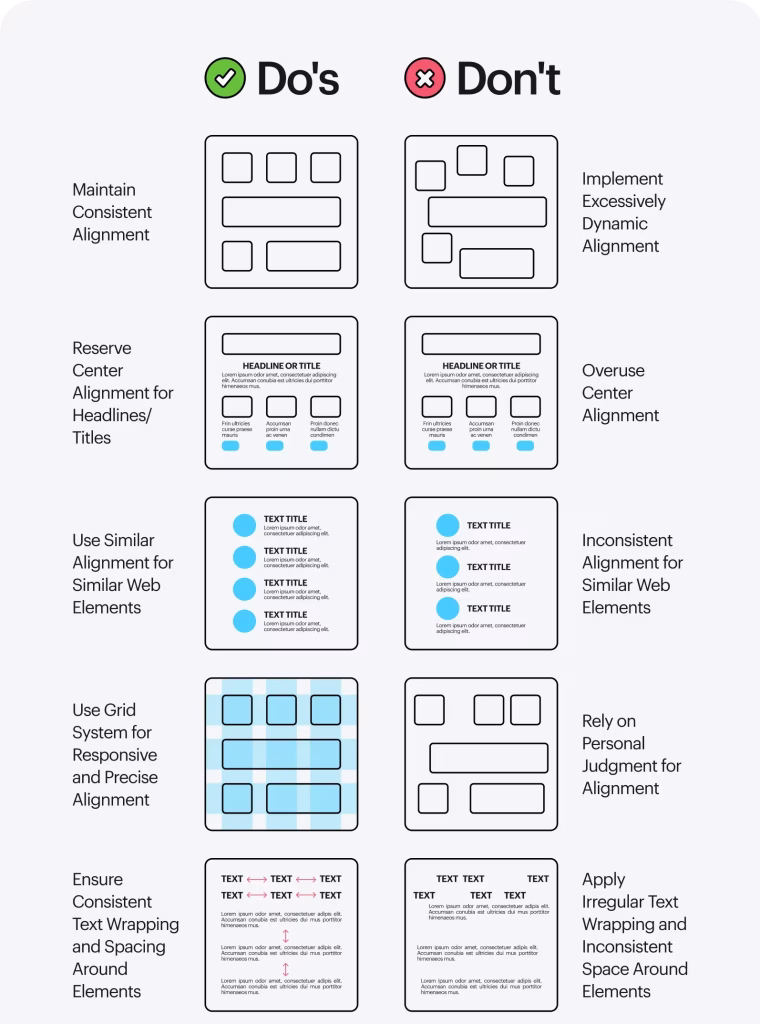
5.1 Inconsistency
One of the most common mistakes is using multiple alignment styles within the same interface – for example, a centered headline, left-aligned body text, and a CTA button shifted to the right. Without a clear reason for these changes, the layout becomes cluttered and loses directional guidance. Users can easily lose focus and struggle to identify the main focal points.
5.2. Lack of a Primary Axis
Without a primary alignment axis, elements may appear “floating” on the interface without visual connection. A clear primary axis – vertical or horizontal – acts as the “backbone” that keeps the layout unified. Ignoring this axis leads to a disjointed overall structure, especially in designs with multiple content blocks.
5.3. Overusing Center Alignment for Long Text
Center alignment works well for headlines, quotes, or short pieces of content. However, applying it to long paragraphs makes it harder for readers to follow, as each line starts at a different position. This reduces scanability, a crucial factor in modern web experiences.
5.4. Ignoring the Grid System
Not using a grid system is a mistake that leads to uneven layouts. The spacing between elements can easily become inconsistent, giving a sense of unprofessionalism. Grids not only help achieve precise alignment but also maintain visual rhythm – a key factor in making designs feel clean and natural.
Tips to fix this:
- Always determine the primary alignment axis from the wireframe stage (left, right, or center).
- Establish a clear grid system, e.g., using the 8pt rule or standard column layouts.
- Use a style guide or design system to ensure consistency.
- Test across multiple screen sizes to make sure alignment remains stable in responsive layouts.
A well-aligned design is not only visually appealing but also allows users to interact naturally and comfortably -the ultimate goal for every designer.
6. Conclusion
Alignment is not just about adjusting elements on a layout – it is a way to create visual flow, organize information, and provide a coherent user experience. When applied correctly, alignment allows viewers to intuitively perceive order, professionalism, and intentionality in every detail without having to “think extra” to understand the layout.
A good design always starts with defining a clear primary axis, maintaining consistency, and leveraging the grid system to establish rhythm within the space. Alignment also works in harmony with other principles such as proximity, hierarchy, and balance – all functioning together to communicate information more effectively.
Understanding and practicing alignment not only helps create more visually appealing designs but also enhances the ability to “read” and “feel” a layout. Ultimately, alignment is not just about visual satisfaction – it’s about guiding users’ emotions and behaviors in the most subtle and effective way.
7. References
[1] R. Williams, The Non-Designer’s Design Book, 4th ed. Berkeley, CA: Peachpit Press, 2014.
[2] J. Tondreau, Layout Essentials: 100 Design Principles for Using Grids, Beverly, MA: Rockport Publishers, 2019.
[3] S. Krug, Don’t Make Me Think: A Common Sense Approach to Web Usability, 3rd ed. San Francisco, CA: New Riders, 2014.
[4] J. Garrett, The Elements of User Experience: User-Centered Design for the Web and Beyond, 2nd ed. Berkeley, CA: New Riders, 2011.
[5] Nielsen Norman Group, “Alignment in Visual Design: How to Create Order and Cohesion,” [Online]. Available: https://www.nngroup.com/articles/alignment-visual-design/. [Accessed: Oct. 12, 2025].
[6] Smashing Magazine, “Design Principles: Visual Alignment,” [Online]. Available: https://www.smashingmagazine.com/. [Accessed: Oct. 12, 2025].