When you enter a website, have you ever noticed that your eyes are often immediately drawn to a large headline, a central image, or a bright red “Buy Now” button? That is the power of Visual Hierarchy – also known as the visual hierarchy system.
Visual Hierarchy is one of the most important principles in web design. It not only makes a website easier to look at and easier to use, but also guides users along the journey you want them to take. As a developer who enjoys writing, I have realized that understanding and applying Visual Hierarchy is not only essential for designers, but also something developers should clearly grasp. After all, a web product is the result of close collaboration between both roles.
In this article, I will explore with you everything from the concept and principles to the role and practical techniques for applying Visual Hierarchy in web design. Let’s get started.
1. What Is Visual Hierarchy?
Visual Hierarchy (roughly translated as visual hierarchy system) is the way elements on an interface (text, images, colors, buttons, etc.) are arranged to direct users on what to look at first and what to look at next.
Why is it important?
Users usually skim rather than read everything carefully. Without Visual Hierarchy, a website can easily become “a mess,” making it difficult for users to grasp information and causing them to leave quickly.
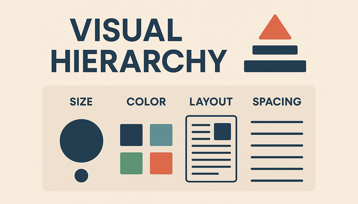
Elements that influence Visual Hierarchy:
- Size: Larger headings usually attract attention first.
- Color & contrast: A “Buy Now” CTA often uses a standout color.
- Position: Important content is placed in the center of the screen or at the top.
- White space: Helps separate elements and highlight what needs emphasis.
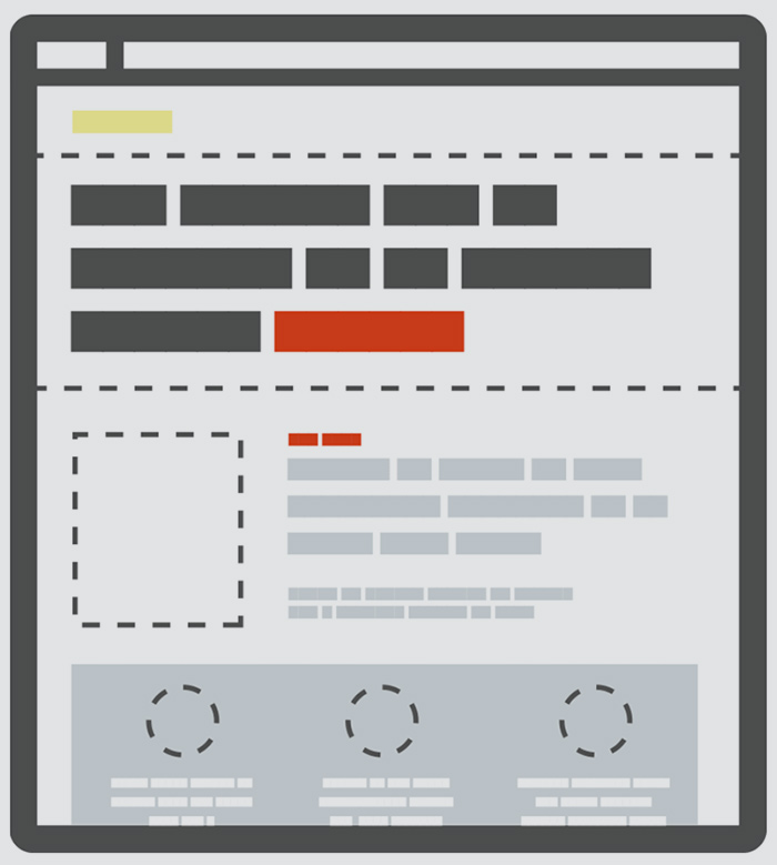
Example: an e-commerce page
- Product name: Displayed large and clearly.
- Product image: Placed at the center to create impact.
- “Buy Now” button: Uses a prominent color to encourage action.
- Detailed description and reviews: Placed below, to be read after interest is established.
In other words, Visual Hierarchy is like a “visual map” that guides the user’s eyes in the right direction.Visual Hierarchy giống như một “bản đồ thị giác”, giúp dẫn dắt mắt người dùng đi đúng
2. Principles That Create Visual Hierarchy
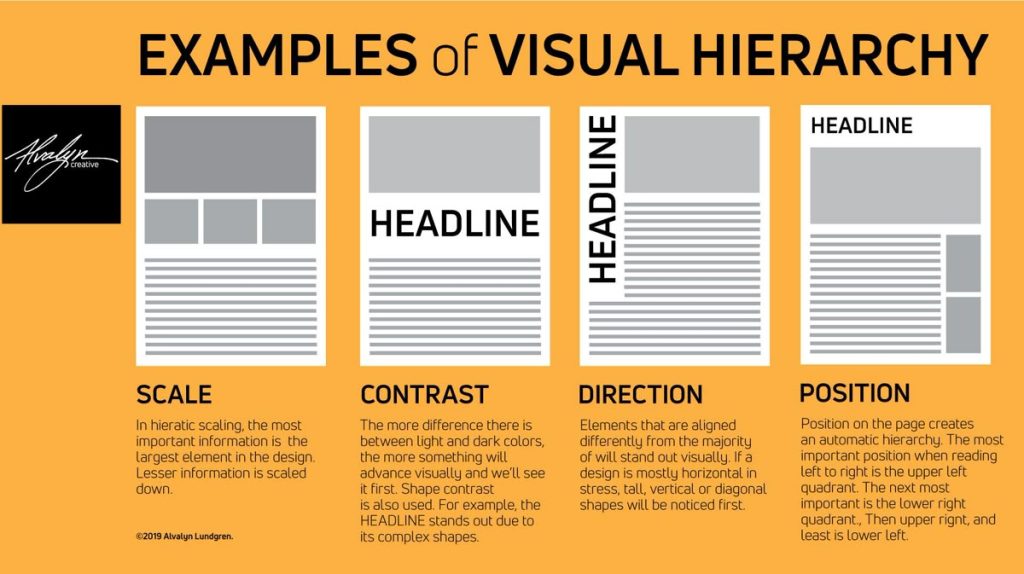
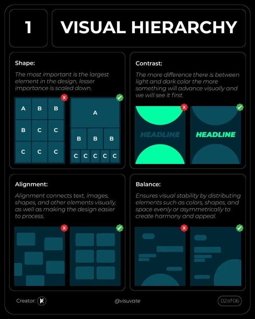
Size & Scale
Larger elements naturally stand out more – this is obvious. However, in design, “large” is not just about attracting attention, but about establishing hierarchy. For example, an article’s H1 heading should be clearly larger than H2 and H3, while the body text should be neatly sized for comfortable reading. If everything is the same size, users will not know what is important.
Color & Contrast
An orange “Buy Now” button standing out against a white background almost always wins. Color has the power to guide both emotion and attention. However, if you throw an entire rainbow onto the interface, the effect is counterproductive—users become confused and do not know where to focus. I usually limit the palette to two or three main colors, using one primary color to emphasize the CTA, while the others serve as background or supporting elements.
Position & Layout
The human eye tends to read following F-patterns or Z-patterns. This means the top-left area is usually seen first, then the eye scans to the right and moves downward. Therefore, important information should be placed in these “hot spots.” A product positioned at the center or at the top of the page has a much higher chance of being noticed than one hidden at the bottom.
Whitespace
Many beginners in design tend to “cram” content to maximize space, resulting in a website that looks like a crowded market flyer. In reality, whitespace is a fundamental part of design. It allows the user’s eyes to “breathe” and makes important elements stand out more clearly. A CTA button surrounded by generous whitespace is far more powerful than one squeezed between blocks of text and images.
Typography – text that speaks visually
Text is not just for reading; it is also a visual element. Bold, heavy fonts convey strength, while thin, light fonts create a sense of elegance. A well-organized system of headings, subheadings, and body text works like a voice with rhythm, allowing readers to skim while still grasping the main ideas.
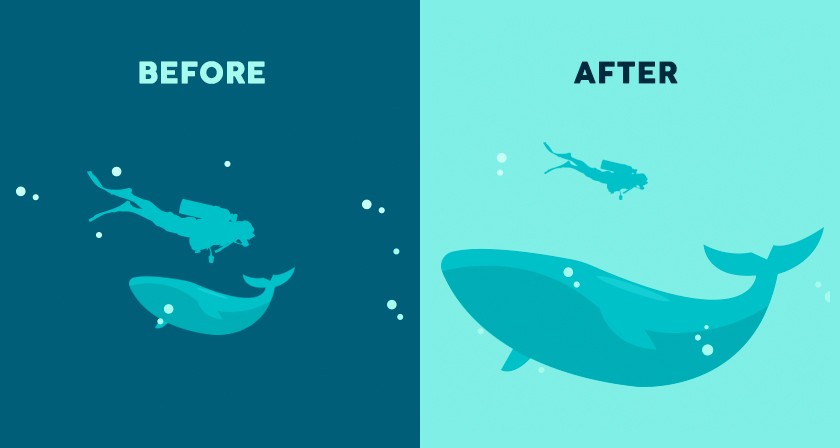
Images and motion
Humans respond to images faster than to text. A well-shot product image, or a character in an image looking toward a “Sign Up Now” button, can subconsciously guide the viewer’s eyes in that direction. Adding a touch of well-considered animation can also create emphasis—but overusing it can easily become distracting.
Finally, there is one principle I particularly like: Gestalt. This is a set of rules describing how the human eye naturally “groups” elements. For example, objects placed close together are perceived as related; elements that share similar colors or shapes are seen as belonging to the same group. Understanding and applying Gestalt principles helps me arrange interfaces in a more natural way – users can understand them at a glance, without explanation.

3. The Role of Visual Hierarchy in Web Design
Visual Hierarchy is not merely a decorative technique; it is the “backbone” that shapes user experience and a website’s business effectiveness. Through my work with design, I have realized that an interface with a clear visual hierarchy can address four critical issues:
3.1. Improving User Experience (UX)
A basic user behavior is scanning rather than reading everything in full. Users first glance at prominent elements, then decide whether to explore further. If a website lacks Visual Hierarchy, users must “figure out for themselves” what the main information is—and this often leads to quick abandonment.
A design with clear hierarchy will:
- Guide the user’s gaze to the right places (for example, headlines and product images).
- Save time when searching for information.
- Create a comfortable, easy-to-digest experience.
As a result, users enjoy a smooth experience without feeling overwhelmed by a jumble of information.
3.2. Enhancing Aesthetics and Trust (UI)
A website with strong Visual Hierarchy looks clean, professional, and well-organized. Users may not analyze it deeply, but they immediately sense “quality” through the layout.
Example:
- A landing page with a clear headline, appealing images, and a prominent CTA button → creates a sense of trust.
- In contrast, a page packed with dense text, no focal points, and everything appearing equal → is often perceived as “amateurish.”
Professional UI (User Interface) design does more than look good; it builds trust and directly influences how users perceive a brand.
3.3. Driving Action (Conversion)
In commercial web design, the ultimate goal is usually conversion: making a purchase, signing up, or clicking a contact button. Visual Hierarchy is the tool that guides users toward this step.
Typical examples:
- A “Sign Up Now” button that is larger, placed in a visible location, and uses contrasting colors.
- Key benefits and features positioned higher on the page so users read them before making a decision.
When users’ eyes are naturally guided toward the CTA, conversion rates increase significantly. In other words, Visual Hierarchy is the bridge between user experience and business action.
3.4. Improving Accessibility
Not everyone has perfect vision. For users with visual impairments or those relying on screen readers, a website with a well-structured visual hierarchy is far more accessible.
Examples include:
- Headings arranged in the correct order (H1 → H2 → H3), allowing assistive technologies to understand the content structure.
- Sufficient color contrast to ensure text readability.
- Appropriate whitespace to separate information and reduce visual clutter.
Thus, Visual Hierarchy does not only serve typical users – it also makes websites more inclusive and accessible. This is a key consideration within the Web Content Accessibility Guidelines.
4. Techniques for Applying Visual Hierarchy
Applying Visual Hierarchy effectively is not just about choosing size or color; it is a systematic set of techniques – from layout and typography to color, motion, and data validation. To create an effective Visual Hierarchy, designers can employ a variety of approaches.
4.1. Layout & Grid
Layout is the most fundamental foundation. Using a grid system helps organize content in a structured way and avoids clutter. In web design, the upper and left areas usually receive attention first, due to the habit of reading from left to right and from top to bottom.
4.2. Typography
Text is not only for reading; it also guides the viewer’s eyes. A clear typography system – from H1 (largest), H2, H3, to body text – helps users immediately understand what is the main heading and what is supporting content. In addition to size, font weight (bold, regular, light) or different colors can be used to create emphasis.
4.3. Color & Contrast
Color has a very strong ability to attract attention. A red CTA button on a white background will certainly stand out. However, it is not just about choosing a bright color; designers must also ensure sufficient contrast for readability while maintaining overall visual harmony.
4.4. Whitespace
Whitespace is not “useless empty space,” but a way to highlight key content. A large heading with space around it will be far more eye-catching than one squeezed between dense paragraphs. Whitespace also makes the interface feel open and comfortable.
4.5. Images & Visual Focus
Images are often the first thing users notice. Therefore, selecting high-quality images that are relevant to the content is essential. Images can also be used to guide the viewer’s gaze—for example, an image of a person looking toward a “Buy Now” button will naturally draw attention in that direction.
4.6. Call to Action (CTA)
The CTA is the “destination” in most commercial web designs. A CTA button should have:
- A size large enough to stand out.
- A color that contrasts with the background.
- A visible position, usually placed right after key information.
4.7. Motion & Micro-Interactions
Small animations and micro-interactions can enhance Visual Hierarchy by subtly drawing attention to important elements and providing feedback to user actions, as long as they are used sparingly and purposefully.
5. Common Mistakes When Applying Visual Hierarchy
Although Visual Hierarchy is a powerful tool in web design, applying it incorrectly can be counterproductive. Below are some common mistakes that many people often make:
5.1. Using Too Many Colors
Colors help emphasize content, but overusing them makes a website visually chaotic and unfocused. When everything is colorful, users can no longer tell what the main focal point is.
Solution: Choose only one or two primary colors and one accent color for CTAs or key information.
5.2. Using Too Many Fonts
Combining too many different fonts makes the interface inconsistent and gives an amateurish impression. For example, a page that mixes serif, sans-serif, and script fonts indiscriminately will look cluttered.
Solution: Use a maximum of two main fonts – one for headings and one for body text. Variations such as bold or italic can be used instead of introducing entirely new fonts.
5.3. Lack of Whitespace
A common mistake is cramming content too closely together, making the website feel cramped and hard to follow. When elements lack spacing, users struggle to identify what information is important.
Solution: Leverage whitespace to clearly separate content and highlight key elements.
5.4. Overusing Animation
Animations can enhance interactivity, but excessive use turns them into distractions. Users may lose focus or even leave the page if they are constantly interrupted by unnecessary motion.
Solution: Use animations sparingly, keeping them short, subtle, and purposeful – for example, a gentle hover effect on a CTA button or a simple fade-in on scroll.
6. Modern Trends in Visual Hierarchy
Visual Hierarchy does not stand still – it evolves along with design trends and technology. In recent years, several notable trends have emerged that anyone working in web design should pay attention to.
6.1 Minimalist design – simple yet powerful
Minimalism is not merely about “reducing details,” but about carefully selecting and retaining only the most important elements. A landing page with a large headline, a short description, and a clear CTA button can sometimes be more effective than a long, content – heavy page. Minimalism helps users focus immediately on the core message without distraction.
6.2 Glassmorphism and Neumorphism – visual effects that create depth
These two styles offer a fresh, modern feel:
- Glassmorphism: translucent, frosted-glass-like backgrounds that convey a clean and contemporary look.
- Neumorphism: soft raised and inset effects that make the interface resemble a tangible object.
However, it is important to note that overuse can reduce contrast and make text harder to read. Therefore, these styles are best applied to cards, secondary backgrounds, or decorative elements, rather than serving as the primary background for an entire website.
6.3 Micro-interactions – small details, big impact
Subtle effects such as a button changing color on hover or an icon gently vibrating when clicked can make the experience feel more “alive.” They help users sense that the system is responding to their actions. That said, micro – interactions are only effective when used sparingly and thoughtfully. Overuse can become distracting and negatively impact performance.
6.4 AI in design – a new assistant for designers
Today, AI goes beyond writing code; it can suggest layouts, color schemes, and even generate multiple design variations for testing. In terms of Visual Hierarchy, AI can help create sample layouts based on users’ reading habits. The key point, however, is that AI only provides suggestions – the final decision always belongs to humans. A good design still depends on human judgment, context, and aesthetic sensibility.
7. Conclusion
Visual Hierarchy is not merely a design technique; it is the way we “guide” users’ eyes and emotions. When applied correctly, it makes content clearer, easier to absorb, and creates a seamless user experience.
Even as trends evolve – from minimalism and new visual effects to the support of AI – the core principle remains unchanged: design must be user-centered. A website that looks good is not enough; it needs to be easy to understand, easy to interact with, and genuinely valuable.
If you are a designer, consider Visual Hierarchy a “guiding compass” for arranging every element on the page. And if you are a user, you may begin to notice why your eyes naturally pause on a certain button, or why one headline always stands out more than the rest.
8. References
[1] Nielsen Norman Group, “Visual Hierarchy: Organizing Content to Guide Users,” Nngroup.com. [Online]. Available: https://www.nngroup.com/articles/visual-hierarchy. [Accessed: Oct. 5, 2025].
[2] Interaction Design Foundation, “The Role of Visual Hierarchy in UX Design,” Interaction-design.org. [Online]. Available: https://www.interaction-design.org/literature/topics/visual-hierarchy. [Accessed: Oct. 5, 2025].
[3] W. Lidwell, K. Holden, and J. Butler, Universal Principles of Design. Rockport Publishers, 2010.
[4] S. Krug, Don’t Make Me Think, Revisited: A Common Sense Approach to Web Usability. New Riders, 2014.
[5] J. J. Garrett, The Elements of User Experience. New Riders, 2011.