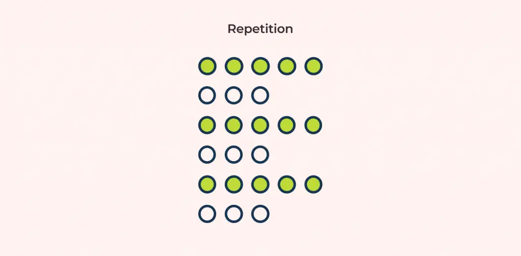
The principle of Repetition in design refers to the consistent reuse of design elements across a product, including colors, typography, icons, buttons, and layouts. This repetition creates consistency, enhances user experience, and makes the product more recognizable, harmonious, and professional.
When applied correctly, Repetition helps users quickly navigate information, recognize functionality, and perceive the visual structure of a product. Conversely, improper use can make a design feel cluttered, inconsistent, and less effective in communicating its message.
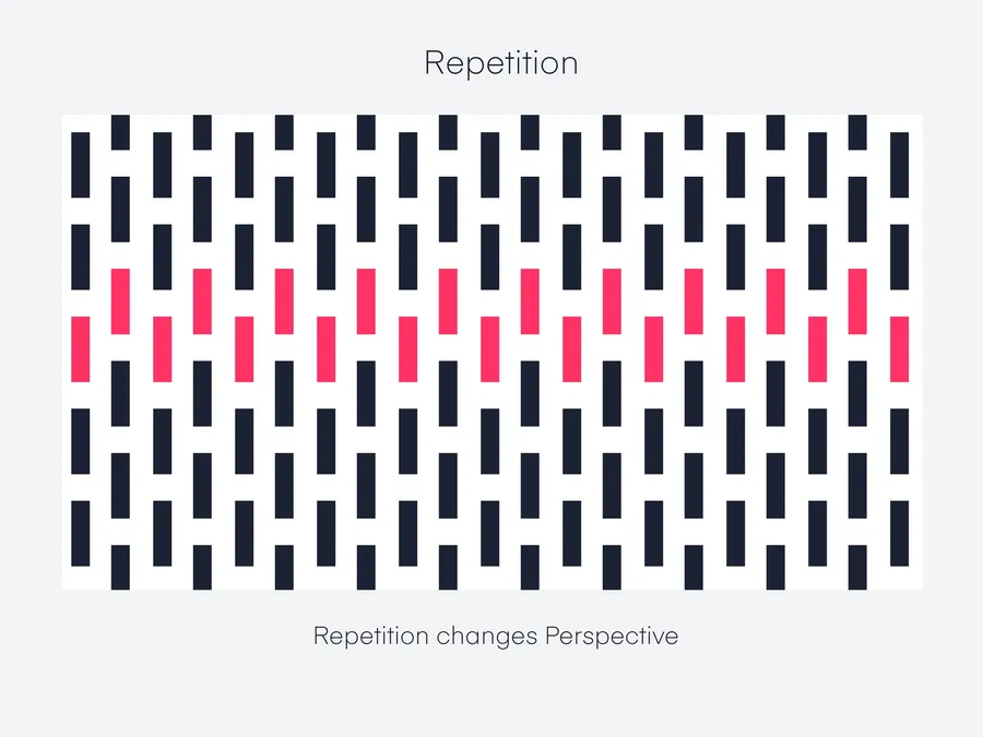
1. What is the Repetition Principle?
Repetition, also known as the “reuse of design elements,” refers to intentionally repeating design components across an entire product. These components can include colors, typography, icons, images, buttons, layouts, or patterns.
The key point is that Repetition is not random duplication, but a deliberate effort to create consistency and improve recognition. When a button, icon, or color appears repeatedly in the same way, users can quickly understand its function and perceive the interface as more intuitive and user-friendly.
Compared to other design principles:
- Alignment: focuses on positioning and arranging elements
- Contrast: creates differences to highlight important information
- Proximity: groups elements together to show relationships
Meanwhile, Repetition complements these principles by establishing familiarity and a consistent visual aesthetic across the entire product.
Examples:
- All headings use the same font and color
- Buttons share the same background color, border-radius, and padding
- Icons for features follow a consistent style and color scheme
2. Why Repetition Is Important in Design
The principle of Repetition plays an important role in design because it helps a product become consistent, easily recognizable, and professional.
- Increasing Brand Recognition:
When colors, fonts, logos, or icons are repeated across multiple pages or products, users can easily recognize the brand. For example, Facebook’s blue buttons or YouTube’s signature red color are instantly identifiable. - Helping Users Navigate Easily:
If all “Submit” buttons or primary actions share the same style, users can quickly understand which actions are primary and which are secondary, without wasting time searching. - Creating Harmony and Professionalism:
A design that uses too many different fonts, colors, or styles makes the interface look cluttered and unprofessional. Repetition ensures a consistent layout, is easy on the eyes, and conveys a sense of reliability.
Illustrative Example:
- A website that uses many different fonts for headings, content, and menus → looks cluttered.
- On the same website, if Repetition is applied (one font for headings, one font for content, a consistent primary color for buttons and links) → it becomes easy to read, harmonious, and professional.
3. Common Types of Repetition
In design, Repetition is often applied in the following main forms, helping a product become consistent, visually appealing, and easily recognizable:
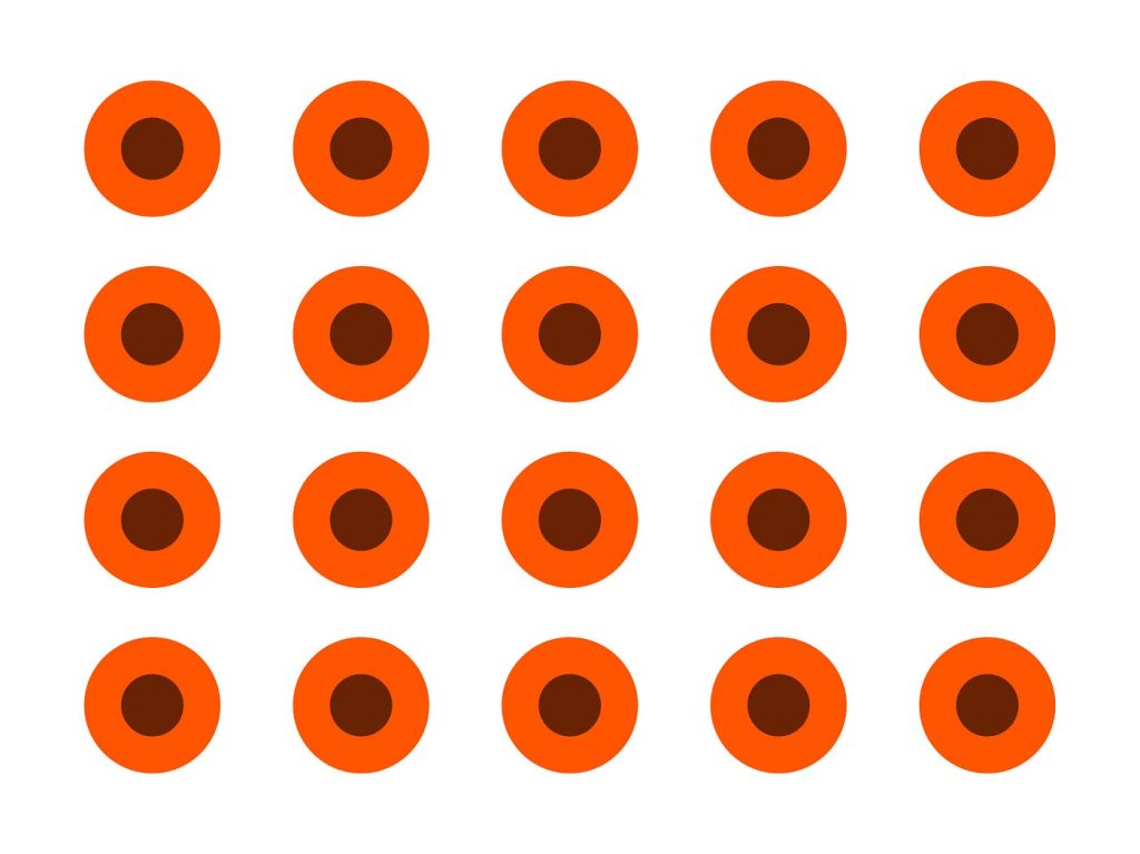
Repetition in Color
Using a consistent primary color across the entire product helps create unity and enhances brand recognition.
- Example: all primary buttons are blue, links are light blue, and background sections use neutral colors.
- Benefit: users can easily distinguish actions and important sections, while the product looks harmonious and professional.
Repetition in Typography
Repeating font-family, font-size, and font-weight makes the interface easy to read and avoids visual clutter.
- Example: headings use Roboto Bold 24px, main content uses Roboto Regular 16px, and annotations or links use Roboto Italic 14px.
- Benefit: clearly differentiates types of information while maintaining consistency.
Repetition in Icons and Images
Using the same icon or illustration style helps users recognize functions quickly and intuitively.
- Benefit: creates visual consistency and prevents a cluttered appearance when multiple icons or images are used.
- Example: all functional icons are outlined and color-coordinated with the brand color; illustrations for articles follow the same flat or line-art style.
Repetition in Layout
Grids, spacing, and margin/padding are applied consistently across sections
- Example: sections have the same padding/margin, product cards follow a 3-column grid on desktop and 1-column on mobile.
- Benefit: ensures a clear layout, makes content easy to scan, and helps users follow information across the entire page.
Repetition in Patterns
Repeating design patterns, including button styles, border styles, and background patterns.
- Example: all buttons have a 5px border-radius with a light shadow; all cards use the same border style and hover effect.
- Benefit: creates aesthetic consistency, increases professionalism, and makes interactive elements easily recognizable.
4. How to Apply Repetition Effectively
To apply Repetition effectively, it can be done in three main steps:
Creating a Style Guide or Design System
First, identify the basic elements that need to be repeated: primary colors, fonts, icon styles, and button styles.
- This serves as a standard set of rules for consistent reuse across the entire product.
- It helps reduce visual clutter and ensures consistency of interface components.
Combine with Other Design Principles
- Alignment: align buttons, text, and elements to create harmony.
- Contrast: clearly distinguish between primary and secondary buttons or important information.
- Proximity: group related buttons, forms, or features together so users can easily recognize relationships.
Practice and Evaluation
- Look at the product as a whole and check whether elements are consistently repeated.
- Test on multiple devices to ensure Repetition is not broken when responsive.
- Adjust if inconsistencies in color, font, icon, or spacing are observed.
5. Common Mistakes When Applying Repetition
When practicing Repetition, some common mistakes can reduce the effectiveness and professionalism of a design if overlooked.
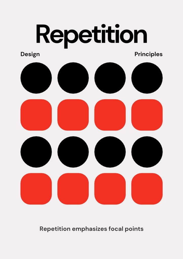
Overuse
- Repeating all elements without creating focal points can make the design boring and monotonous.
- Example: all buttons, icons, and headings look exactly the same, with no distinction between primary and secondary actions → users cannot easily identify important points.
Inconsistency
- Using multiple styles for the same type of element (button, icon, heading, link) → breaks consistency, making the interface feel unprofessional and hard to recognize.
- Example: headings of the same level use different fonts, or icons with the same function use different styles and colors → the interface looks cluttered and disjointed.
Ignoring Responsive Design
- Repetition can be broken when displayed on different devices if responsiveness is not considered.
- Example: buttons are large on desktop but too small on mobile, spacing between sections is inconsistent on tablet → breaks harmony, making it harder for users to interact.
Not Combining with Other Principles
- If focusing only on Repetition and ignoring Alignment, Contrast, and Proximity, the interface may be consistent but not intuitive.
- Example: all buttons share the same style but are placed randomly, or primary/secondary actions are not distinguished → users still struggle to navigate.
Practical Examples:
- A website uses different button colors in each section → users must search for the primary action.
- Headings of the same level use different fonts → the interface looks unprofessional and cluttered.
6. Conclusion
The principle of Repetition is a powerful design tool, creating consistency, brand recognition, and smooth user experience. When applied correctly, it not only makes the interface harmonious and professional but also enhances brand recognition and helps users navigate information easily.
However, like all design principles, Repetition should be used thoughtfully: avoid overuse, maintain consistency, and consider responsiveness across devices. Combining Repetition with other principles such as Alignment, Contrast, and Proximity ensures a product that is intuitive, easy to use, and visually appealing.
Understanding and applying Repetition intelligently will help you design products that are both attractive and user-friendly while delivering a consistent and reliable user experience.
7. Tài liệu tham khảo
[1] K. Samara, Design Elements, Color Fundamentals: A Graphic Style Manual for Understanding How Color Affects Design, Rockport Publishers, 2014.
[2] R. L. Jacobson, Web UI Design Best Practices, 2nd ed., New York: Apress, 2018.
[3] K. Lidwell, Universal Principles of Design, 2nd ed., Beverly, MA: Rockport Publishers, 2010.
[4] J. Nielsen and R. Molich, “Heuristic evaluation of user interfaces,” in Proceedings of the SIGCHI Conference on Human Factors in Computing Systems, 1990, pp. 249–256.
[5] A. Krug, Don’t Make Me Think: A Common Sense Approach to Web Usability, 3rd ed., Berkeley: New Riders, 2014.
[6] Google Material Design Guidelines, “Typography, Color, and Components,” [Online]. Available: https://material.io/design. [Accessed: Oct. 19, 2025].