Visual design is not just about “making things look good” – it’s a way to convey information, evoke emotions, and guide viewers to the most important points. In an interface or poster crowded with elements competing for attention, the principle of Contrast plays a crucial role: it helps establish information hierarchy, create focal points, and improve readability.
In this article, we will explore the principle of Contrast in depth: from its concept, types of contrast, how to apply it in web and UX design, to common mistakes and useful tools for evaluation.

1. Concept of Contrast in Design
Contrast is the clear difference between two or more visual elements such as color, size, typography, shape, spacing, or motion. Thanks to contrast, elements within a layout do not blend together but are clearly separated, making it easier for the eye to identify the focal points of the design.
When an element has high contrast compared to its background or surrounding parts, the human eye is naturally drawn to it – this is a natural visual response. Therefore, contrast not only creates emphasis but also guides the viewer’s gaze, directing them along a logical sequence intended by the designer.
In practice, contrast is often used to:
- Establish visual hierarchy: Helps viewers quickly distinguish between primary and secondary content.
- Enhance readability and legibility: Ensures text is clear and accessible on any background.
- Convey emotion and design style: Strong contrast creates a modern, dynamic feel, while subtle contrast evokes elegance and minimalism.
→ In short, contrast is the “guiding thread” that directs the viewer’s gaze to the right place, transforming a design from dull to dynamic and easy to understand.
2. Why Contrast Is Important in Design
Contrast is not just an aesthetic element; it is a foundation for effectively conveying visual information. A design with good contrast helps viewers immediately understand what is the focal point and what is secondary, allowing them to absorb information more naturally.
- Creating Focus: The human eye can only concentrate on certain elements at a time. With contrast, we can guide their gaze to the most important parts – such as headings, buttons, or main images.
- Organizing Information: Using contrast in size, color, or spacing helps layer content, making it easier for viewers to read and understand the overall structure.
- Improving User Experience (UX): When contrast is applied appropriately, readers don’t have to strain to distinguish elements, reducing eye fatigue and speeding up information intake.
- Enhancing Accessibility: Text with clear contrast between font and background enables people with low vision or mild visual impairments to read content easily.
For example, a “Call to Action” (CTA) button that is brightly colored, larger in size, and spaced away from other elements will attract more clicks than a subdued, small button that blends in with the background.
3. Common Types of Contrast in Design
Contrast is a tool that makes designs clearer, more engaging, and easier to understand. By knowing how to combine different types of contrast, you can guide the viewer’s behavior and emotions effectively.
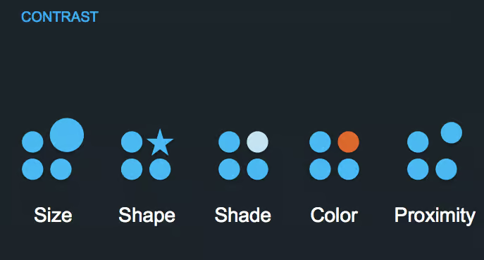
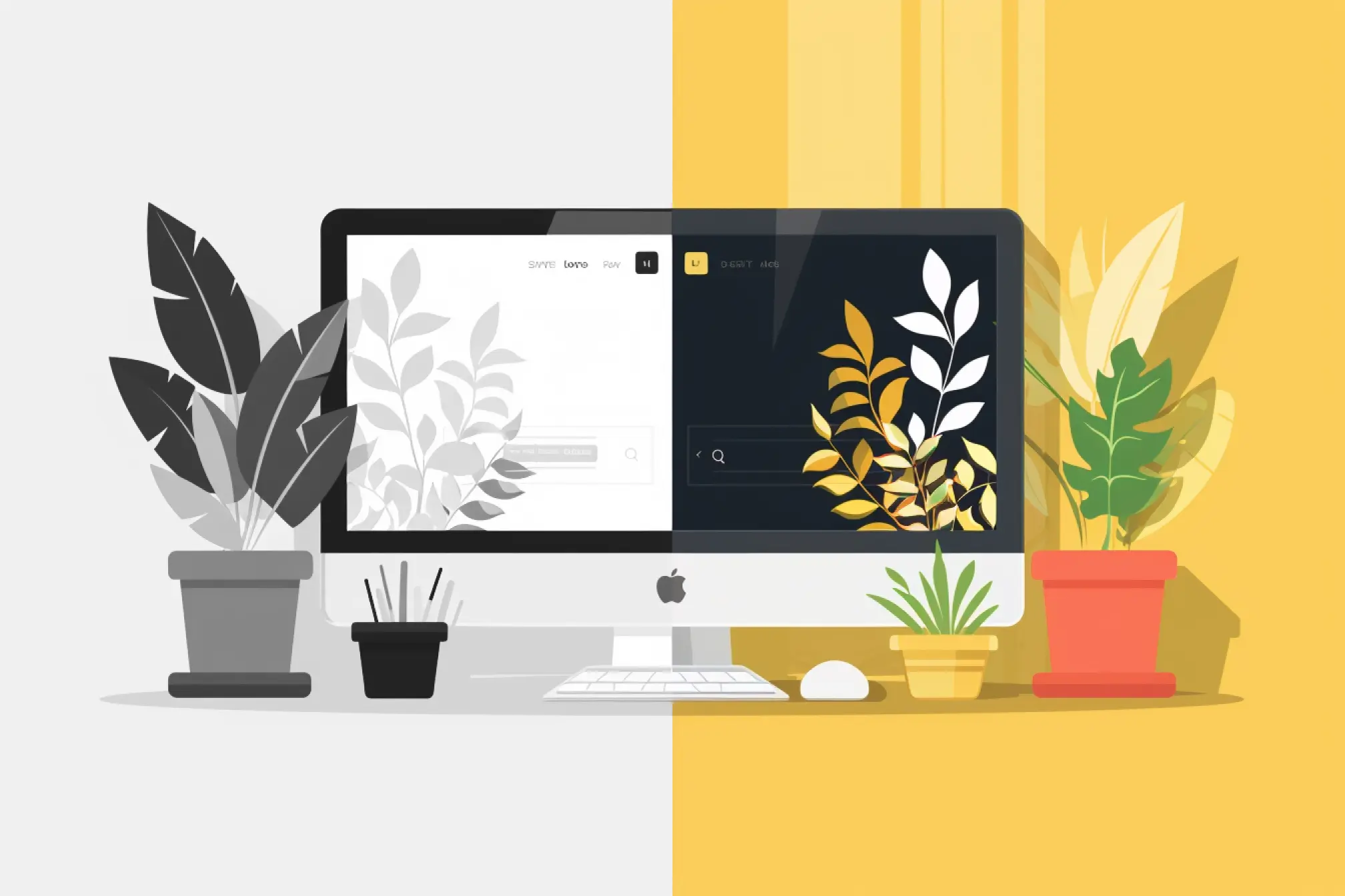
3.1 Color Contrast
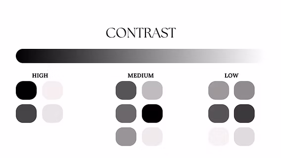
This is the most common and easily noticeable type. Color contrast helps create emphasis, establish visual hierarchy, and ensure readability.
The three main factors of color contrast:
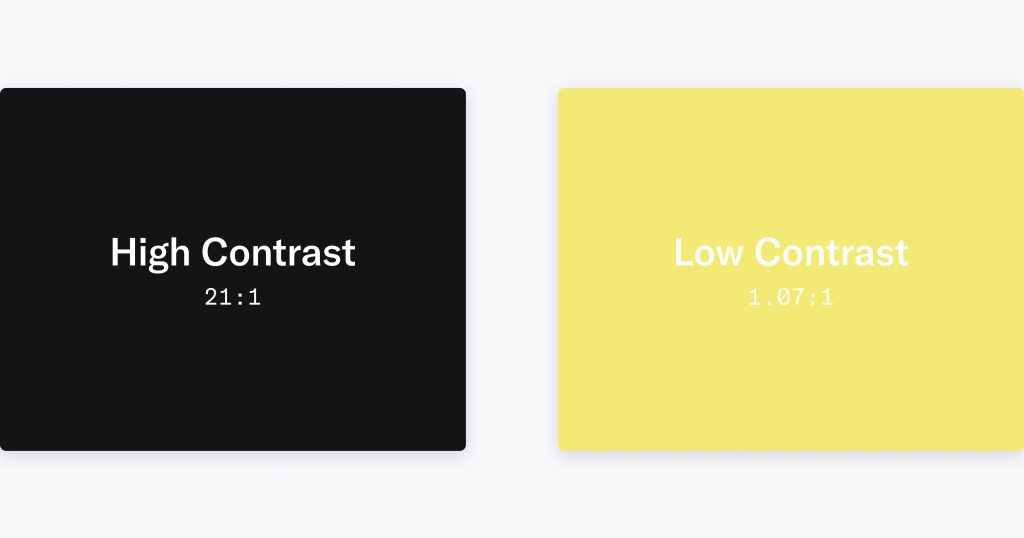
- Luminance (lightness/darkness): White text on a black background, or vice versa, is always easier to read than gray text on a gray background.
- Hue (color): Warm colors (red, orange) typically stand out more than cool colors (blue, purple).
- Saturation: Highly saturated colors attract more attention than muted tones.
Practical guidelines:
- Maintain a minimum contrast ratio of 4.5:1 between text and background (according to WCAG standards).
- Apply the 60–30–10 rule for color distribution: 60% primary background color, 30% secondary color, 10% accent color.
- When designing UI, test in grayscale mode to check the actual contrast
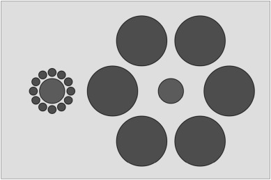
3.2 Size Contrast
Size is a key factor in establishing visual hierarchy.
- Large headings draw immediate attention.
- Smaller body text creates balance and ensures it doesn’t overpower the heading.
- Maintain reasonable ratios: for example, headings 1.5 – 2 times larger than body text.
Tip:
You can apply size contrast not only to text but also to icons, buttons, cards, or image thumbnails to guide users’ attention more effectively.
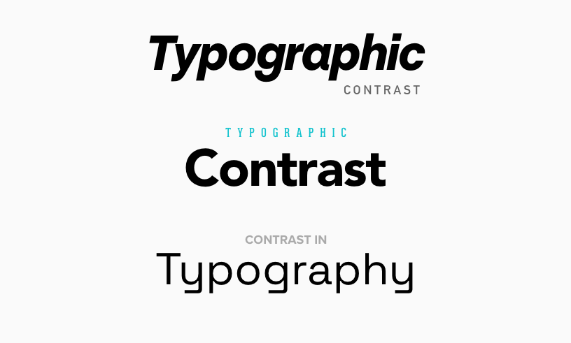
3.3 Typography Contrast
Differences in typography help create style and emphasize important content.
- Combine serif and sans-serif fonts to distinguish headings from body text (e.g., serif headings – sans-serif body).
- Use bold, light, or uppercase text to add emphasis.
- Limit to 2–3 fonts maximum to maintain consistency.
- Adjust line-height and letter-spacing to enhance readability, especially on small screens.
3.4 Shape Contrast
Different shapes convey different visual meanings:
- Circles often suggest softness and friendliness.
- Squares or rectangles convey solidity and strength.
- Curved lines feel natural, while straight lines indicate rigidity and modernity.
In UI, a circular button among many square cards will immediately stand out. You can leverage this to highlight Call-to-Action elements or important information.

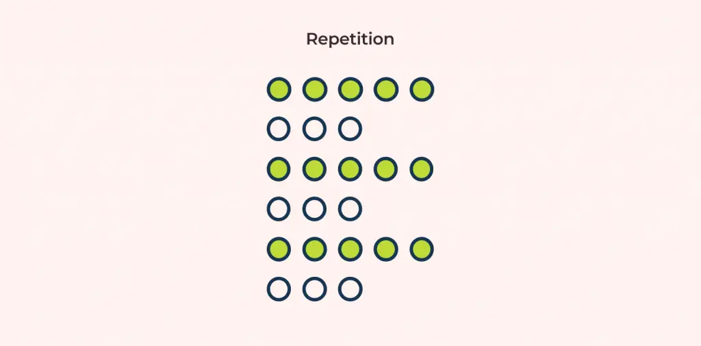
3.5 Contrast in Spacing (Space / Layout Contrast)
White space is a subtle yet extremely powerful form of contrast.
- It gives the viewer’s eyes a place to “rest,” helping to avoid a feeling of visual overload
- It highlights the main content by clearly separating different blocks of information.
- It improves readability, especially in minimalist design.
Tip:
Consider white space as a “design element” rather than “unused empty space.” Many professional designs consist of 30–40% carefully calculated empty space.
3.6 Contrast in Texture, Pattern, or Motion (Texture / Motion Contrast)
Contrast exists not only in static elements but also in perception and movement.

- Texture (pattern): a smooth surface versus a rough surface can create a sense of depth.
- Motion (movement): dynamic elements (animations, hover effects) tend to attract more attention than static elements.
Lưu ý:
- Use animation with a clear purpose (transitions, user feedback).
- Avoid overusing motion, as it can cause visual fatigue or distraction
4. How to Apply Contrast Effectively in Web Design
For contrast to truly fulfill its role in web design, it should not stop at simply “choosing eye-catching colors,” but requires a systematic mindset and clear purpose. Below are the principles and practical steps I often apply to ensure contrast is both effective and harmonious:
- Start with context: Before choosing colors or fonts, define the design goal. What do you want users to focus on? What action should they take? Once you clearly understand the focal point (for example, clicking the “Sign Up” button or reading the product description), you can apply contrast in the right places to guide the viewer’s attention.
- Establish a visual hierarchy: Use contrast in size, color, and typography to determine the reading order on the page. For example, large and bold headings help users grasp the main topic, while smaller text supports detailed information.
- Check contrast for accessibility: A visually appealing design is not enough if users with impaired vision cannot read it. Test the contrast between text and background using tools like WebAIM Contrast Checker or the Figma Contrast Plugin to ensure a minimum ratio of 4.5:1 for normal text (according to WCAG standards).
- Maintain consistency: Keep a consistent contrast logic throughout the website. For example, the accent color of CTA buttons should remain uniform across all pages; headings, body text, and links should follow consistent styling so users can easily recognize and remember them.
- Test under different display conditions: A design may look great on a bright screen but appear faint in dark mode or on low-brightness displays. Test across multiple devices, resolutions, and environments. If possible, print it out or use “grayscale” mode to check whether the contrast still holds.
Applying contrast effectively not only makes the interface clearer and more professional, but also reflects sophistication in user experience – where every element is intentionally designed and serves its proper function.
5. Common Mistakes When Using Contrast
- Overusing contrast: When everything tries to “stand out,” nothing truly stands out. Using too many strong colors, large fonts, or opposing effects can tire the viewer’s eyes and eliminate the main focal point.
- Insufficient contrast for text: This is a basic but very common mistake. When the text and background colors are too similar, users have to strain their eyes to read – especially with small text or on mobile screens.
- Poor color combinations: Even with high contrast, if two colors clash too harshly (for example, red and neon green), the overall design will look harsh and unprofessional.
- Ignoring accessibility: Failing to check contrast ratios against standards (such as WCAG) makes it difficult for users with visual impairments to read the content.
- Optimizing for only one mode: Some designs look good only in light mode but break completely in dark mode – reducing the user experience across different platforms.
6. Một số mẹo và công cụ hỗ trợ kiểm tra Contrast
Below are some useful tips and tools to help you check and optimize contrast in design:

- WebAIM Contrast Checker – A simple, WCAG-compliant tool that helps measure the contrast ratio between text and background to ensure good readability.
- Figma Contrast Plugin / Adobe Color – Supports real-time testing during the design process, allowing you to preview contrast results when adjusting colors.
- Design in black and white first – If the layout remains clear and readable without color, it means your visual hierarchy is solid.
- Print your design – Viewing a printed version can sometimes help you evaluate contrast more objectively than on a screen.
- Use CSS color variables – This approach makes it easier to adjust the entire color system when changing themes or optimizing contrast across different light/dark modes.
7. Conclusion
Contrast is not only a visual element that makes a design stand out, but also an important tool for guiding user experience. A design with good contrast helps viewers read easily, understand quickly, and focus on the main content. However, contrast should be used intentionally – just enough to create emphasis, without overusing it and making the interface visually overwhelming. When you know how to combine different types of contrast (color, size, shape, spacing, etc.) and regularly check for accessibility, your product will be both aesthetically pleasing and user-friendly for all audiences.
8. References
[1] W3C, Web Content Accessibility Guidelines (WCAG) 2.1, 2018. [Online]. Available: https://www.w3.org/TR/WCAG21/
[2] Smashing Magazine, “The Importance of Contrast in Web Design,” Smashing Magazin, 2020. [Online]. Available: https://www.smashingmagazine.com/
[3] Nielsen Norman Group, “Visual Hierarchy: Organizing Web Page Design,” NNGroup, 2021. [Online]. Available: https://www.nngroup.com/articles/visual-hierarchy/
[4] Interaction Design Foundation, “Contrast and Visual Hierarchy in UX Design,” IxDF, 2022. [Online]. Available: https://www.interaction-design.org/
[5] WebAIM, “Contrast Checker,” WebAIM Accessibility Tools, 2023. [Online]. Available: https://webaim.org/resources/contrastchecker/