In the digital age, the first impression of a website is formed within just a few seconds – or even fractions of a second. Visual design is therefore not merely “decoration” but becomes the first language of communication between a product and its users. A well-organized interface with rhythm, contrast, and clear hierarchy helps viewers understand content more quickly, feel more confident, and enjoy a smoother experience.
In the context of modern web design – where user experience is paramount – mastering the principles of visual design is extremely important. These principles are not only guidelines for aesthetics but also serve as the foundation for creating clear layouts, guiding the viewer’s eye, and conveying messages effectively.
1. Definition of Visual Design
Visual design is the combination of art and science in organizing, arranging, and balancing visual elements such as color, shape, space, typography, and imagery to convey messages in a clear and emotionally engaging way. The goal of visual design is not only to create an “attractive” interface but also to help users understand quickly, perceive accurately, and act easily.
In the context of modern web design, visual design shapes how users perceive the value and information structure of a website. A clear layout, harmonious colors, and well-placed emphasis can help users grasp content within the first few seconds.
Unlike user interface (UI) design – which focuses on functionality and interactivity – visual design emphasizes emotional experience and visual perception: which elements draw attention first, what feelings are evoked when users visit, and how the brand message is communicated. When executed well, visual design allows users not only to “understand” but also to “feel” the essence the website intends to convey.

2. Principles of Visual Design in Modern Web Design
In this section, we list and explain the foundational principles. These principles are not rigid rules, but when applied consistently, they help make designs clear, understandable, and trustworthy.
2.1 Visual Hierarchy
Visual hierarchy is the organization of information according to its level of importance, guiding the user’s eye and behavior. When users open a page, their eyes scan in a flow – our task is to control that flow so users receive the key information first.
Practical application: Clearly identify main headings, highlights (CTAs), and supporting content. The goal is to reduce the user’s “cognitive effort” – they should immediately understand what to do next.
2.2 Balance
Balance is the sense of stability in a layout. There are two main types: symmetrical balance, which conveys formality and safety, and asymmetrical balance, which creates a dynamic, modern feel.
On the web, balance is achieved by coordinating block sizes, white space, and the placement of images relative to text. A balanced layout helps users feel comfortable and confident while reading content.
2.3 Contrast
Contrast creates differences to attract attention. Contrast can be in color, size, font, or weight. Its purpose is to make important elements stand out from the background while ensuring readability.
A website lacking contrast can make information blend together; conversely, good contrast helps users quickly recognize content hierarchy.
2.4 Alignment
Alignment creates order and connection between elements. When everything is properly aligned – whether by margins, axes, or grids – the page looks more professional, and users can follow the flow of information easily.
Alignment is not just about being “lined up”; it also maintains consistency across sections – from headings and paragraphs to content blocks and images so the eye doesn’t have to “jump around” while reading.
2.5 Proximity
This principle states that elements with a logical relationship should be placed close to each other. When labels, descriptions, and input fields are grouped appropriately, users can understand their function without extra effort.
Proximity reduces visual clutter and speeds up recognition, which is especially important in forms, pricing tables, or content blocks with many elements.
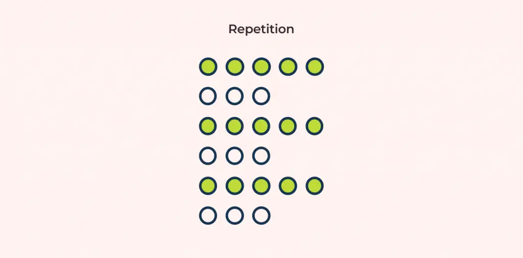
2.6 Repetition
Repeating design elements -such as color, typography, icons, and button styles -creates consistency and reinforces brand recognition. Repetition makes the system appear professional and easy to navigate, as users start to recognize patterns and know how to interact quickly.
However, repetition doesn’t mean monotony; it’s important to balance familiarity with fresh highlights to keep the design engaging.
2.7 White Space
White space, or negative space, is the “breathing room” between elements. Proper white space enhances readability, emphasizes key points, and creates a sense of elegance.
Many novice designers fear leaving empty space, but in reality, white space is a powerful tool for controlling visual focus.

2.8 Typography
Typography is not just about choosing attractive fonts; it determines readability, professionalism, and emotional impact. A good typography system has a clear hierarchy (headings, subheadings, body text), appropriate line spacing, and considers font size across different devices.
Typography also conveys tone: sans-serif fonts often feel modern, while serif fonts can convey formality or tradition. Choosing the right font for the intended message is essential.
2.9 Color Theory
Color conveys emotion and plays a significant role in brand recognition. Palette selection should be based on the desired emotional impact while ensuring sufficient contrast for accessibility.
Use color purposefully: colors for CTAs, colors for status indicators (success, error), background colors, and accent colors should all work together harmoniously.
2.10 Consistency
Consistency is a unifying principle: it ensures that all other principles are applied throughout the design. A website with good consistency reduces cognitive load, builds trust, and creates a smooth user experience.
Consistency is often maintained through a design system, style guide, or component library, ensuring that all elements follow the same standards.
3. The Role of Design Principles in Modern Web Design
The principles of visual design are not just theoretical concepts from books; they form the foundation for shaping real user experiences. When applied correctly, they help a website be both aesthetically pleasing and effective, creating a balance between emotional impact and functionality.
- Enhancing Professionalism and Credibility: A website with a clear layout, harmonious colors, and a consistent visual system immediately conveys professionalism to users. This first impression strongly influences trust – especially in e-commerce or financial services, where reliability is a key factor.
- Improving User Experience (UX): When hierarchy is well-organized, users can find information quickly without confusion or distraction. Good visual design makes the experience feel natural, reduces cognitive load, and provides comfort while navigating content.
- Optimizing Conversions: A purposefully guided layout – from CTA button colors and eye flow to the positioning of important elements – can significantly increase conversion rates. Users not only view content but are encouraged to take action.
- Increasing Brand Recall: Consistency in color, typography, icons, and imagery style helps users easily recognize and remember the brand. Repeated, coherent visual experiences create long-term engagement between users and the product.
- Supporting Accessibility: Visual design principles also ensure that everyone can access the content – from choosing appropriate color contrast, readable font sizes, to reasonable spacing between elements. This not only enhances user experience but also demonstrates respect for a diverse audience.
Overall, the principles of visual design function as the backbone of the modern web experience -where aesthetics, usability, and business objectives blend seamlessly into a unified whole.
4. Practical Application
Applying visual design principles in practice helps a web project become more consistent, clear, and effective. Here are the basic steps:
- Start with research and goal definition: Understand who the users are, what they need, and what the website aims to achieve – whether it’s delivering information, driving conversions, or building brand awareness.
- Establish grid and layout: A grid acts as the framework to maintain balance and consistency, particularly useful when scaling the interface.
- Build content hierarchy: Identify the main message, supporting elements, and CTAs, arranging them by priority to guide the user’s eye naturally.
- Choose color palette and typography: Develop a consistent palette and typography system to reinforce brand identity and ensure readability.
- Apply white space and proximity: Use white space to separate content blocks, and group related elements so users can follow information easily.
- Check contrast and accessibility: Ensure proper contrast ratios, font sizes, and spacing so that all users can access the content.
- Create and maintain reusable components: Build buttons, cards, forms, etc., that can be reused across the site to maintain consistency.
- Test and refine: Observe real users, collect feedback, and adjust the design to better meet user needs.
For example, an effective landing page typically has a clear layout: Hero → Key Features → Social Proof → CTA, all organized according to visual hierarchy and a consistent color palette.
5. Conclusion
Visual design in modern web development is not just about “making things look nice”; it is a way to convey messages through visual language. When we understand and correctly apply the principles – from balance and contrast to visual hierarchy – we create interfaces that are not only attractive but also enable users to interact naturally and effectively.
In today’s competitive digital environment, a website with strong visual design demonstrates professionalism, brand recognition, and a consistent user experience. The key is to always design with purpose – every color, spacing, and visual element should carry intentional meaning.
For me, visual design goes beyond “how it looks”; it is the way a website tells its own story – clearly, emotionally, and authentically.
6. References
[1] S. Lidwell, W. Holden, and J. Butler, Universal Principles of Design, Rockport Publishers, 2010.
[2] R. Lidwell, “Gestalt Principles in Design,” Interaction Design Foundation, 2023.
[3] J. Tschichold, The Form of the Book: Essays on the Morality of Good Design, Lund Humphries, 1991.
[4] S. Krug, Don’t Make Me Think: A Common Sense Approach to Web Usability, New Riders, 2014.
[5] N. Fairhurst, “Using Proximity to Create Better UI Layouts,” UX Collective, 2022.